A Guide to Using Grids in Your Designs for Better Layouts
I still remember the moment it clicked for me – the realization that a guide to using grids in your designs wasn’t just about following a set of rules, but about creating a harmonious balance between form and function. It was during my time at a minimalist design agency in Scandinavia, where I had the opportunity to work on a project that required me to rethink my approach to design. My mentor, a wise and experienced designer, told me that the key to good design lies in its simplicity, and that a well-crafted grid system is the foundation upon which all great design is built.
In this article, I’ll share with you the practical advice I’ve learned over the years about creating effective grid systems, and how to apply them to your own design work. You’ll learn how to use grids to create a sense of visual hierarchy, and how to balance type and image to create a cohesive and engaging design. My goal is to provide you with a clear understanding of how to use grids to elevate your design, and to help you develop a more intentional approach to your work. By the end of this guide, you’ll be equipped with the knowledge and skills to create designs that are not only aesthetically pleasing, but also functional and effective.
Table of Contents
Guide Overview: What You'll Need

Total Time: 1 hour 15 minutes
Estimated Cost: $10 – $30
Difficulty Level: Easy
Tools Required
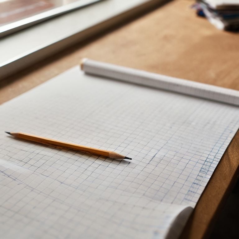
- Graph Paper (for creating grid patterns)
- Ruler (12 inches long)
- Pencil (sharp)
Supplies & Materials
- Grid Paper Pads (various sizes)
- Markers or Colored Pencils (for color-coding grid sections)
- Eraser (for correcting mistakes)
Step-by-Step Instructions
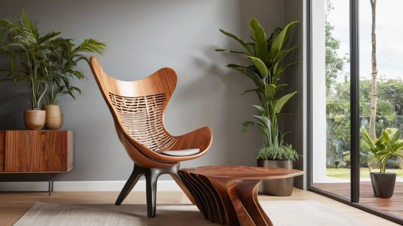
- 1. First, let’s establish a clear understanding of what a grid is and why it’s essential in design. A grid is a system of intersecting lines that help you organize and structure your design elements in a way that creates harmony and balance. To start using grids in your designs, begin by sketching out a few different grid systems on paper, considering the golden ratio and how it can be applied to create a sense of proportion and balance.
- 2. Next, choose a design project you’re currently working on, or start a new one, and decide on the type of grid you want to use. This could be a simple symmetrical grid or a more complex asymmetrical grid, depending on the needs of your project. Consider the content you need to display and the message you want to convey, as this will help you determine the best grid system for your design.
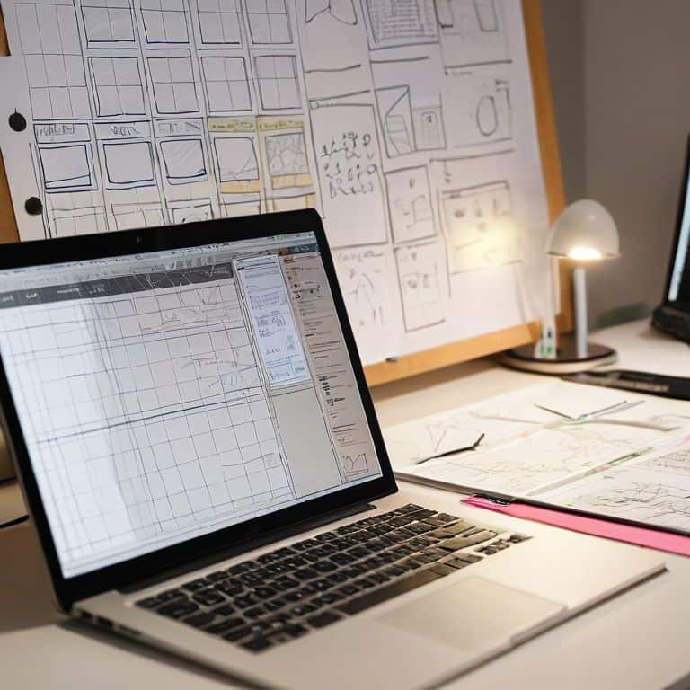
- 3. Now, it’s time to set up your grid in your design software. Most design programs, such as Adobe InDesign or Sketch, have built-in grid tools that make it easy to create and customize your grid. Start by creating a baseline grid, which will help you align your text and other elements in a consistent and harmonious way. This is where the magic happens, and your design starts to take shape.
- 4. With your grid in place, start adding your design elements, such as text, images, and shapes. Use the grid to guide your placement and sizing decisions, ensuring that everything is aligned and balanced. Remember, the grid is not a constraint, but a tool that helps you create a sense of visual flow and hierarchy in your design.
- 5. As you add more elements to your design, pay attention to the negative space around and between them. A good grid system will help you create a sense of breathing room and balance, making your design feel more intentional and refined. Don’t be afraid to experiment and adjust your grid as needed to achieve the desired balance and harmony.
- 6. Once you have all your elements in place, take a step back and evaluate your design as a whole. Check to see if your grid is working in harmony with your content, and make any necessary adjustments. Consider the visual weight of your elements and how they interact with each other, making sure that your design feels balanced and cohesive.
- 7. Finally, don’t be afraid to break the rules and experiment with your grid system. While grids provide a sense of structure and harmony, they can also be used to create tension and interest in your design. By carefully subverting the expectations of your grid, you can create a design that feels both balanced and dynamic, with a sense of visual surprise that engages and delights the viewer.
A Guide to Using Grids
As I delve deeper into the world of grids, I’m reminded of the wise words of Massimo Vignelli: “The grid system is an aid, not a guarantee.” To truly unlock the potential of grids, one must consider the responsive grid systems that underpin modern design. This means thinking about how your grid will adapt to different screen sizes and devices, ensuring a seamless user experience.
When working with grids, it’s essential to strike a balance between structure and flexibility. Grid based web design requires a deep understanding of how different elements interact with one another, and how to create a harmonious balance between text, images, and negative space. By using grid layout best practices, designers can create layouts that are both aesthetically pleasing and highly functional.
To take your grid-based designs to the next level, consider exploring graphic design grid templates and experimenting with different configurations to find what works best for your project. Additionally, familiarizing yourself with css grid framework can help you implement your designs with ease and precision, allowing you to focus on the creative aspects of your work.
Mastering Grid Based Web Design
To truly master grid-based web design, one must understand the intricacies of balance and harmony. As Massimo Vignelli once said, “The grid system is an aid, not a guarantee.” It’s a tool that helps us create a visual flow, guiding the viewer’s eye through the design. By applying a grid, we can establish a clear typographic hierarchy, creating a sense of order and cohesion.
Effective grid-based design is not just about dividing a page into equal parts, but about creating a rhythm that engages the user. It’s about using the grid to create a sense of tension and release, guiding the user’s attention through the design. By mastering this technique, designers can create websites that are not only visually appealing but also highly functional and user-friendly.
Unlocking Responsive Grid Systems
To create flexible designs, I always stress the importance of responsive grid systems. This is where the true power of grids comes into play, allowing your design to adapt seamlessly to different screen sizes and devices. By defining a set of rules for how your grid behaves at various breakpoints, you can ensure a consistent and harmonious visual language throughout.
As Massimo Vignelli once said, “The grid system is an aid, not a guarantee.” I believe this is especially true when it comes to responsive design. By combining a well-structured grid with a clear understanding of how it will respond to different screen sizes, you can create designs that are both visually stunning and highly functional.
Elevating Your Craft: 5 Essential Tips for Working with Grids
- Start with a clear understanding of your design’s underlying structure, and let the grid be the foundation that guides your creative decisions
- Experiment with different grid ratios and densities to find the perfect balance for your project, and don’t be afraid to break the rules when necessary
- Remember that a grid is not a constraint, but a tool for creating harmony and visual flow – use it to create a sense of rhythm and hierarchy in your design
- Don’t underestimate the power of white space: a well-designed grid should also take into account the empty spaces between elements, and use them to create a sense of breathing room and clarity
- Study the work of design masters like Massimo Vignelli, and learn from their use of grids to create timeless and elegant designs that continue to inspire and influence designers today
Key Takeaways for Elevating Your Design with Grids
Effective use of grids is not just about organization, but about creating a visual rhythm that guides the viewer’s eye and tells a story
A well-designed grid system can adapt to various screen sizes and devices, making it an essential tool for responsive and user-friendly design
By mastering the principles of grid-based design, you can create a clear typographic hierarchy, balance composition, and ultimately, craft designs that are both aesthetically pleasing and functional
The Grid: A Designer's North Star
A grid is not a constraint, but a catalyst – it’s the difference between a chaotic mess and a harmonious balance of form and function, where every element, no matter how small, serves a purpose and tells a story.
Alistair Finch
Embracing the Rhythm of Grids

As we’ve explored throughout this guide, mastering the grid is not just about following a set of rules, but about understanding the underlying principles of harmony that make a design truly effective. From unlocking responsive grid systems to mastering grid-based web design, the key to success lies in striking a balance between structure and creativity. By applying the principles outlined in this guide, you’ll be well on your way to creating designs that are not only visually stunning but also intentionally crafted to communicate your message with clarity and precision.
As you continue on your design journey, remember that the grid is not a constraint, but a liberating force that allows you to focus on the essence of your message. Don’t be afraid to experiment, to push the boundaries of what’s possible, and to embrace the rhythm of the grid. With time and practice, you’ll develop a deep understanding of the grid’s power and be able to wield it with confidence, creating designs that are truly timeless and unforgettable.
Frequently Asked Questions
How do I determine the optimal number of columns for my grid system?
To determine the optimal number of columns, consider the content’s complexity and the desired rhythm. As Massimo Vignelli said, “The grid system is an aid, not a guarantee.” I find that 3-5 columns often provide a sweet spot for balance and flexibility, allowing for a clear hierarchy and breathing room. Experiment and trust your instincts to find the right fit.
What are some common mistakes to avoid when implementing a responsive grid in my design?
When implementing a responsive grid, I see many designers fall into the trap of over-complicating their systems. Avoid using too many breakpoints and focus on creating a flexible, modular grid that adapts to different screen sizes. As Massimo Vignelli once said, “The grid system is an aid, not a guarantee.” Keep it simple, yet intentional.
Can a grid system be used effectively in combination with other design principles, such as asymmetry or white space?
Absolutely, a grid system can be combined with other design principles like asymmetry or white space. In fact, Massimo Vignelli once said, ‘The grid system is an aid, not a guarantee.’ By balancing structure with intentional asymmetry and breathing room, you can create visually striking designs that still feel cohesive and harmonious.