The Best Free Fonts for Designers: a Curated List

As a designer, I’ve often found myself scouring the internet for the best free fonts for designers that can elevate my work without breaking the bank. It’s a challenge many of us face: we want to create something unique and captivating, but we’re limited by our budget. The right font can make all the difference, setting the tone for our entire design. Good typography is the foundation upon which great design is built, and having access to a wide range of high-quality fonts is essential for any designer looking to make a statement.
In this list, I’ll be sharing my top 5 picks for the best free fonts for designers, each one chosen for its unique character and versatility. By the end of this article, you’ll have a solid understanding of how to elevate your design game with these carefully curated fonts. You’ll learn how to pair them with other design elements, how to use them to create visual hierarchy, and how to make the most of their unique features. Whether you’re a seasoned designer or just starting out, these fonts are sure to become staples in your design toolkit, helping you to create work that is both beautiful and effective.
Table of Contents
The Elegant Solution
As a designer, I’ve always been fascinated by the versatility of the Montserrat font. This sans-serif font, designed by Julieta Ulanovsky, is a masterclass in simplicity. With its geometric lines and urban feel, Montserrat is perfect for designing modern and sleek visual identities. I’ve used it in various branding projects, and it never fails to impress. Its clean lines and legibility make it an excellent choice for both digital and print media.
The Timeless Classic
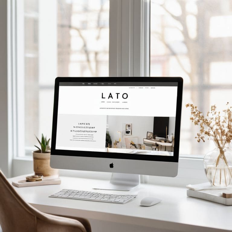
The Lato font, designed by Łukasz Dziedzic, is a timeless classic that never goes out of style. Its rounded edges and open feel make it perfect for designing friendly and approachable visual identities. I’ve used Lato in various web design projects, and it always adds a touch of elegance and sophistication. Whether you’re designing a website or a mobile app, Lato is an excellent choice for creating a coherent and visually appealing user experience.
The Bold Statement
The Great Vibes font, designed by Robert Leuschke, is a bold statement font that’s perfect for making a big impact. Its flamboyant lines and ornate details make it ideal for designing eye-catching headlines and titles. I’ve used Great Vibes in various branding projects, and it always adds a touch of glamour and excitement. Whether you’re designing a poster or a social media graphic, Great Vibes is an excellent choice for creating a memorable and attention-grabbing visual identity.
The Minimalist's Dream
The Open Sans font, designed by Steve Matteson, is a minimalist’s dream. Its clean lines and simple geometry make it perfect for designing modern and sleek visual identities. I’ve used Open Sans in various web design projects, and it always adds a touch of elegance and sophistication. Whether you’re designing a website or a mobile app, Open Sans is an excellent choice for creating a coherent and visually appealing user experience. As Massimo Vignelli once said, ‘the best design is the one that is not noticed’ – Open Sans is a perfect example of this philosophy.
The Vintage Charm
The Playfair Display font, designed by Claus Eggers Sørensen, is a vintage charm that’s perfect for adding a touch of elegance and sophistication to your designs. Its ornate details and classical lines make it ideal for designing luxurious and high-end visual identities. I’ve used Playfair Display in various branding projects, and it always adds a touch of glamour and excitement. Whether you’re designing a poster or a social media graphic, Playfair Display is an excellent choice for creating a memorable and attention-grabbing visual identity. As I always say, ‘a good font can make or break a design’ – Playfair Display is definitely a game-changer.
Key Takeaways for Timeless Typography
Incorporating high-quality free fonts into your design arsenal can elevate your work and provide a fresh perspective, as seen in the likes of elegant sans-serifs and classic serifs
A well-curated selection of free fonts, such as those from renowned foundries or crafted by independent type designers, can become a cornerstone of your design identity and help you communicate your message with clarity and intention
By understanding the nuances of typography and making informed choices about the fonts you use, you can create designs that not only stand the test of time but also reflect a deep appreciation for the art of typographic design, as championed by design masters like Massimo Vignelli
Timeless Typography
A good font is not just a aesthetic choice, but a thoughtful decision that elevates the message and creates a lasting impression – and the best part is, you don’t have to break the bank to get it just right.
Alistair Finch
Conclusion: The Timeless Power of Free Fonts
As we’ve explored the crème de la crème of free fonts, it’s clear that each of these typography gems offers a unique character that can elevate our designs. From the sleek, modern lines of Montserrat to the elegant, classic curves of Merriweather, these fonts are not just free – they’re also incredibly versatile. By incorporating them into our design toolkit, we can add a level of depth and sophistication to our work that might otherwise be out of reach. Whether you’re a seasoned designer or just starting out, these fonts are a great place to start building your typographic foundation.
So, the next time you’re faced with a design challenge, remember that the right font can make all the difference. Don’t be afraid to experiment and push the boundaries of what’s possible with these incredible free resources. As Massimo Vignelli once said, ‘The life of a designer is a life of fight: fight against the ugliness.’ With these free fonts, you’ll be well-armed to take on that fight and create something truly beautiful.
Frequently Asked Questions
How do I choose the right free font for my design project without overwhelming myself with too many options?
To choose the right free font, I recommend filtering by project context and desired mood. Consider the typography hierarchy and how the font will interact with other elements. Ask yourself, as Massimo Vignelli would, “Is it necessary, is it clear, and is it beautiful?” This intentional approach will help you navigate the vast options and find the perfect fit.
Are free fonts really suitable for professional design work, or should I always opt for paid alternatives?
While some may argue that free fonts lack the sophistication of their paid counterparts, I firmly believe that quality trumps cost. A well-crafted free font can elevate a design just as effectively as a pricey one, as Massimo Vignelli once said, “The life of a designer is a life of fight: fight against the ugly; against the ordinary.
What are some common pitfalls to avoid when using free fonts in my designs to ensure they look polished and sophisticated?
When using free fonts, beware of inconsistent typography and lack of cohesion. Avoid mixing too many fonts, and instead, opt for a clear hierarchy. As Massimo Vignelli said, “Typography is the core of graphic design.” Choose fonts with intention and ensure they align with your design’s overall message to maintain a polished look.


