A Guide to the 7 Elements of Design
As I sit amidst my collection of vintage design books, I often find myself pondering the misconceptions surrounding the 7 elements of design. It’s astonishing how often these fundamental principles are obscured by trendy jargon and overcomplicated theories. In my experience, the true power of design lies not in flashy gimmicks, but in the thoughtful application of timeless principles. The 7 elements of design are not a secret formula, but rather a straightforward framework for creating intentional, effective visual communications.
In this article, I promise to cut through the noise and provide you with honest, experience-based advice on how to harness the 7 elements of design. I’ll share my own insights, gained from years of working in minimalist design agencies and specializing in branding and visual identity systems. My goal is to empower you with a deep understanding of these essential principles, allowing you to create designs that are not just aesthetically pleasing, but also intentionally crafted to communicate your message with clarity and precision. By the end of this journey, you’ll be equipped to think like a designer, and to approach your work with the confidence that comes from understanding the foundational rules of good design.
Table of Contents
Foundations of Design
As I delve into the principles of design composition, I’m reminded of the wise words of Massimo Vignelli: “The life of a designer is a life of fight: fight against the ugliness.” It’s a notion that resonates deeply with me, and one that I believe is at the heart of creating effective visual communications. When we think about design, we often consider the visual elements that make up a composition, but it’s the underlying structure that truly brings a design to life.
A well-designed visual hierarchy, for instance, can make all the difference in guiding the viewer’s eye through a piece. This is where designing with negative space becomes crucial, as it allows us to create a sense of breathing room and balance within the composition. By carefully considering the interplay between positive and negative space, we can create a sense of balance and symmetry in art that draws the viewer in and holds their attention.
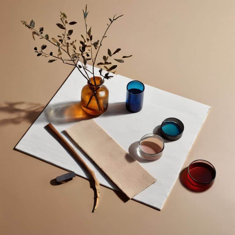
As we explore the foundations of design, it’s essential to consider the role of color theory for designers and how it contributes to the overall mood and atmosphere of a piece. By combining a thoughtful approach to color with a deep understanding of texture and pattern, we can create designs that are not only visually striking but also rich in depth and emotion.
Principles of Design Composition
When it comes to design composition, balance is crucial. It’s about creating a visual equilibrium that guides the viewer’s eye through the design. I recall Massimo Vignelli’s words on the importance of balance in achieving a sense of harmony.
Effective design composition relies on a clear understanding of visual hierarchy. By organizing elements in a logical and intentional manner, designers can create a narrative that engages and informs the viewer. This principle is essential in creating designs that are both aesthetically pleasing and functional.
Visual Hierarchy in Design Explained
As we delve into the realm of design composition, it’s essential to understand the concept of visual hierarchy. This fundamental principle allows designers to guide the viewer’s attention through a careful arrangement of visual elements. By doing so, we create a clear narrative, drawing the viewer’s eye to the most critical information.
Effective design relies on establishing a clear typographic hierarchy, where each element is carefully considered to convey its relative importance. This thoughtful approach enables designers to create a visual flow, leading the viewer through the design with intention and purpose.
Mastering the 7 Elements of Design
As I delve into the world of design, I’m reminded of the wise words of Massimo Vignelli, who once said, “Design is one.” To truly master the fundamentals of design, one must understand the intricacies of principles of design composition. This involves carefully considering the relationship between various elements, such as texture, pattern, and negative space, to create a visually appealing and balanced composition.
When designing, it’s essential to consider the visual hierarchy in design, which refers to the way in which the human eye navigates a composition. By carefully balancing balance and symmetry in art, designers can create a sense of harmony and stability, drawing the viewer’s attention to key elements. This can be achieved through the strategic use of color, texture, and pattern, as well as the thoughtful application of color theory for designers.
By embracing these fundamental principles, designers can unlock the full potential of their creations, crafting compositions that are at once beautiful, functional, and thought-provoking. As a designer, I’ve found that designing with negative space can be a powerful tool in creating a sense of simplicity and elegance, allowing the eye to rest and focus on the essential elements of the design.
Balance and Symmetry With Negative Space
When it comes to creating a sense of harmony in design, balance and symmetry play a crucial role. By carefully considering the placement of visual elements, designers can craft a composition that feels stable and visually appealing. This is where negative space comes into play, allowing the eye to rest and creating a sense of breathing room within the design.
Effective use of negative space can lead to a cleaner aesthetic, one that guides the viewer’s attention and creates a sense of flow. By balancing positive and negative elements, designers can create a sense of tension and resolution, drawing the viewer into the design and engaging them on a deeper level.
Color Theory for Designers Unlocked
As designers, we often underestimate the power of color in our work. However, color theory is a fundamental aspect of creating visually appealing and effective designs. A deep understanding of color principles can elevate our designs from mere decoration to intentional communication.
When applying color to our designs, it’s essential to consider the 60-30-10 rule, which suggests that a dominant color should occupy 60% of the space, a secondary color 30%, and an accent color 10%. This balance creates harmony and visual interest, drawing the viewer’s eye through the design.
Unpacking the Essentials: 5 Key Tips to Master the 7 Elements of Design
- Embrace the power of typography: As Massimo Vignelli once said, ‘Typography is the core of graphic design,’ and I couldn’t agree more – a well-crafted typographic hierarchy can make or break a design
- Balance composition with intention: Don’t just decorate a page; use the principles of design composition to create a visual flow that guides the viewer’s eye
- Color with purpose: Understand the psychology of color and use it to evoke emotions, convey messages, and create harmony in your design
- Play with negative space: Don’t be afraid of empty space – it’s a powerful tool for creating balance, simplicity, and focus in your design
- Grids are your friends: As I always say, ‘A grid and a clear typographic hierarchy can solve any design problem’ – use them to bring order, structure, and clarity to your work
Key Takeaways: Timeless Design Principles
Intentional design is rooted in a deep understanding of the 7 elements of design, which serve as the foundation for creating effective visual communications that captivate and endure
A well-crafted visual hierarchy, informed by principles of design composition, is crucial for guiding the viewer’s attention and conveying the message with clarity and purpose
By mastering the interplay of color, typography, and negative space, designers can create balanced and symmetrical compositions that communicate their message with precision and elegance, rising above fleeting trends and decorating to create meaningful design
The Timeless Essence of Design
The 7 elements of design are not merely a checklist, but a symphony of intentional decisions that elevate our work from mere decoration to meaningful communication – a harmony of line, shape, color, and texture that resonates with the human experience.
Alistair Finch
Embracing the Timeless Power of Design
As we’ve explored the 7 elements of design, from the foundations of design composition to the nuances of color theory and the strategic use of negative space, it’s clear that mastering these principles is key to creating work that truly resonates. By understanding and applying the concepts of visual hierarchy, balance, and symmetry, designers can craft visual communications that are not only aesthetically pleasing but also intentionally designed to engage and persuade. Whether you’re a seasoned professional or just beginning your design journey, embracing these timeless principles can elevate your work and help you think like a designer.
As you continue on your path, remember that good design is not just about decoration; it’s about intentional communication. It’s about using the elements and principles of design to convey a message, tell a story, or evoke an emotion. So, don’t just follow trends or mimic the work of others – push the boundaries of what’s possible with design. Experiment, innovate, and always keep the why behind your design decisions at the forefront of your mind. By doing so, you’ll not only create work that stands out but also contribute to the ongoing evolution of our craft, one thoughtful, well-designed piece at a time.
Frequently Asked Questions
How do the 7 elements of design interact with each other to create a cohesive visual identity?
The 7 elements – line, shape, color, texture, size, value, and space – interact harmoniously when guided by a clear typographic hierarchy and grid system, as Massimo Vignelli would attest. This synergy creates a visual identity that’s both cohesive and impactful, elevating design from mere decoration to intentional communication.
Can the 7 elements of design be applied universally across different design disciplines, such as graphic design, interior design, and architecture?
While the 7 elements of design originated in graphic design, their principles – such as balance, contrast, and hierarchy – are indeed universal, transcending disciplines to inform interior design, architecture, and beyond, as Massimo Vignelli would attest, “design is one”.
What role do current design trends play in the application of the 7 elements of design, and how can designers balance timelessness with timely relevance?
As Massimo Vignelli once said, “Style is not to be confused with fashion.” Trends come and go, but timeless design principles endure. I believe designers should balance timelessness with timely relevance by understanding the ‘why’ behind a trend, and then applying the 7 elements of design with intention and clarity, rather than blindly following the latest fad.


