A Guide to Using White Space in Design Effectively
As I sit here, surrounded by my collection of vintage design books, I’m reminded of the wise words of Massimo Vignelli: “Whitespace is to be assured, not to be feared.” Yet, I’ve seen countless designers struggle with the concept of a guide to using white space in design, often filling every inch of their canvas with unnecessary elements. The truth is, effective use of white space is not about emptying your design, but about creating a rhythm that guides the viewer’s eye.
In this article, I promise to cut through the noise and provide you with practical advice on how to harness the power of white space in your designs. You’ll learn how to use intentional emptiness to create a sense of breathing room, and how to balance your composition to achieve a sense of harmony. Whether you’re a seasoned designer or just starting out, this guide will give you the tools and confidence to create designs that are not only visually stunning, but also intentionally crafted to communicate your message with clarity and precision.
Table of Contents
Guide Overview: What You'll Need
Total Time: 1 hour 15 minutes
Estimated Cost: $0 – $10
Difficulty Level: Easy
Tools Required
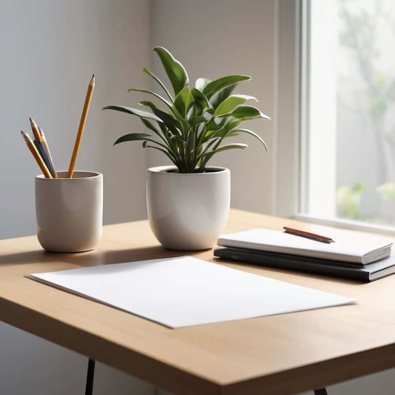
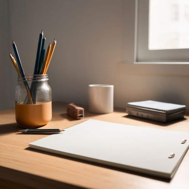
- Ruler (for measuring margins)
- Pencil (for sketching designs)
- Eraser (for correcting mistakes)
- Computer (with design software)
Supplies & Materials
- Paper (for sketching)
- Design Software (such as Adobe Creative Cloud)
- Style Guide (for reference)
Step-by-Step Instructions
- 1. First, let’s understand that white space is not just empty space, but rather a deliberate design choice that can make or break the clarity of your message. To effectively use white space, start by identifying the core elements of your design, such as headings, images, and body text, and consider how you can use white space to create a clear visual hierarchy.
- 2. Next, consider the grid system you’re working with, as it will play a crucial role in determining the balance of white space in your design. A well-structured grid can help you create a sense of rhythm and flow, making it easier to guide the viewer’s eye through your content. I always say, “A grid is like a chessboard – it’s not just about the pieces, but about the space between them.
- 3. Now, let’s talk about typographic hierarchy, which is essential for creating a clear visual flow. Use white space to separate different levels of headings and body text, making it easy for the viewer to understand the structure of your content. As Massimo Vignelli once said, “Typography is the core of graphic design,” and I couldn’t agree more.
- 4. When it comes to images, breathing room is essential. Don’t be afraid to use white space around images to create a sense of depth and visual balance. This will also help to prevent your design from feeling cluttered and overwhelming. Remember, the goal is to create a sense of harmony, not chaos.
- 5. To create a sense of visual balance, consider the weight of different elements in your design. For example, a large image may require more white space around it to balance out its visual weight, while a small icon may require less. This is where the grid system comes in handy, as it can help you achieve a sense of balance and harmony.
- 6. Now, let’s not forget about the negative space created by white space. This can be used to create subtle visual effects, such as guiding the viewer’s eye to a specific element or creating a sense of movement. By intentionally using white space, you can create a sense of dynamism and energy in your design.
- 7. Finally, experiment and iterate to find the right balance of white space for your design. Don’t be afraid to try out different approaches and see what works best for your specific project. As a designer, I can tell you that there’s no one-size-fits-all solution when it comes to white space – it’s all about finding the right rhythm and flow for your unique design challenge.
A Guide to White Space
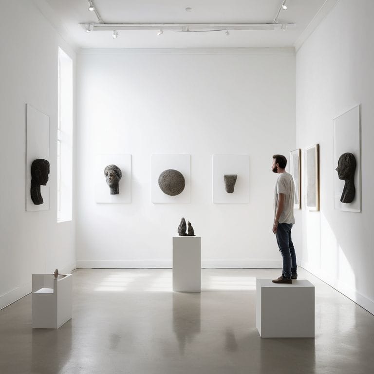
As we delve deeper into the world of intentional design, it’s essential to consider the visual hierarchy in design. This concept is closely tied to the effective use of white space, as it dictates how the viewer’s eye navigates the layout. By carefully balancing elements and creating a clear hierarchy, we can guide the viewer’s attention and create a more immersive experience.
In my experience, balance and proportion in layout are crucial in achieving a harmonious design. This is particularly evident in minimalist web design principles, where simplicity and restraint are key. By applying these principles, designers can create layouts that are not only visually appealing but also highly functional.
When it comes to typography and negative space, the interplay between text and white space becomes even more critical. To achieve designing for readability, it’s essential to strike a balance between the two, allowing the text to breathe while maintaining a clear visual flow. By doing so, we can create designs that are both beautiful and effective, communicating our message with clarity and precision.
Balancing Typography and Negative Space
To create a harmonious balance, I consider typography and negative space as interdependent elements. A well-crafted typographic hierarchy, established through varying font sizes and weights, can guide the viewer’s eye through the composition. As Massimo Vignelli once said, “Typography is the foundation of good design.” By carefully selecting typefaces and adjusting their spacing, I can create a sense of rhythm that complements the surrounding negative space.
In my experience, a balanced typography and negative space can elevate the overall design, making it more legible and visually appealing. A clear typographic hierarchy allows the negative space to breathe, creating a sense of calm and focus. By intentionally combining these elements, designers can create a powerful visual language that communicates their message with clarity and precision.
Visual Hierarchy Through Margins
To establish a clear visual hierarchy, margins play a crucial role. By intentionally setting margins, you create a framework that guides the viewer’s eye through your design. As Massimo Vignelli once said, “The grid system is an aid, not a guarantee.” I find that a well-considered margin helps to create a sense of balance and harmony, allowing the content to breathe.
Effective margin use is about finding the right balance between emptiness and substance. By doing so, you create a rhythm that enhances the overall composition, drawing attention to key elements and creating a clear flow of information.
Harnessing the Power of Negative Space: 5 Essential Tips
- Let white space be your ally in creating visual flow, guiding the viewer’s eye through your design with intention and purpose
- Establish a clear typographic hierarchy to balance text and empty space, ensuring your message is conveyed with clarity and precision
- Use margins and gutters to create a sense of rhythm and harmony, much like the careful composition of a black and white photograph
- Apply the principle of asymmetry to add visual interest, but balance it with empty space to avoid visual clutter and maintain a sense of calm
- Remember, as Massimo Vignelli once said, ‘design is one’ – and white space is the glue that holds your design together, so use it thoughtfully and with restraint
Key Takeaways: Harnessing the Power of White Space
Effective use of white space is not just about aesthetics; it’s a deliberate design choice that guides the viewer’s attention and creates a visual hierarchy
By balancing typography and negative space, designers can create a sense of rhythm and flow, making their work more engaging and easier to navigate
A well-designed white space strategy can elevate a design from mere decoration to a thoughtful, intentional experience that communicates the message with clarity and precision
The Power of Restraint
White space is not just the absence of content, but the thoughtful creation of a rhythm that guides the eye and clarifies the message – it’s what separates design from mere decoration.
Alistair Finch
Embracing the Power of White Space
As we’ve explored throughout this guide, the effective use of white space is crucial for creating visually appealing and intentional designs. We’ve discussed how to establish a visual hierarchy through margins, and how to strike a balance between typography and negative space. By applying these principles, designers can craft compositions that are not only aesthetically pleasing but also clearly communicate their message. Whether you’re working on a branding project or a simple layout, remembering the importance of white space can elevate your work from mere decoration to thoughtful design.
As you move forward, I encourage you to continue experimenting with the rhythm of emptiness in your designs. Don’t be afraid to step back and assess your work with a critical eye, asking yourself if the white space is serving to amplify your message or merely filling a void. By embracing the intentional beauty of white space, you’ll be well on your way to creating designs that are not just beautiful, but also timeless and effective.
Frequently Asked Questions
How can I effectively balance the need for negative space with the requirement to include a large amount of content on a single page?
To balance negative space with ample content, I employ a grid system, as Massimo Vignelli once said, “The grid system is an aid, not a guarantee.” It helps me prioritize and organize content, ensuring breathing room amidst the density, creating a harmonious visual flow.
What are some common mistakes to avoid when using white space in design to ensure it enhances rather than detracts from the user experience?
To truly harness the power of white space, I always advise my students to avoid the pitfalls of over-correction. Don’t fall into the trap of using white space as a Band-Aid for poor typography or lackluster composition. As Massimo Vignelli once said, “Design is one.” Ensure your white space serves the design’s intent, rather than simply filling a void.
Are there any specific design principles or rules of thumb that can help me determine the optimal amount of white space for a given layout or composition?
For me, it’s all about balance and intention. I recall Massimo Vignelli’s words: “Whitespace is to be used, not feared.” A good rule of thumb is to apply a grid system, ensuring margins and gutters are harmonious. This creates a rhythmic flow, allowing your content to breathe.


