A Guide to the Logo Design Process Step-by-step
As I sit here, surrounded by my collection of vintage design books, I’m reminded of the countless times I’ve seen designers struggle with the logo design process step-by-step. There’s a common myth that a great logo is the result of a flash of inspiration, but I’m here to tell you that’s just not true. In reality, crafting a timeless logo is a deliberate and intentional process that requires a deep understanding of typographic hierarchy and visual composition. I’ve seen it time and time again in my work as a brand strategist and designer: a well-designed logo is not just a pretty picture, but a carefully considered mark that speaks to the very heart of a brand.
So, what sets a truly great logo apart from a mediocre one? In this article, I’ll take you through the logo design process step-by-step, sharing my own experiences and insights gained from years of working in the industry. You’ll learn how to create a clear and consistent visual identity that resonates with your audience, and how to avoid common pitfalls that can derail even the best design efforts. By the end of this journey, you’ll have a deep understanding of the principles and practices that underlie great logo design, and you’ll be equipped to create your own timeless and effective logos. Whether you’re a seasoned designer or just starting out, my goal is to provide you with the honest, no-hype advice you need to succeed in the world of logo design.
Table of Contents
Guide Overview: What You'll Need
Total Time: 2 hours 30 minutes
Estimated Cost: $0 – $100
Difficulty Level: Intermediate
Tools Required
- Computer (with internet connection)
- Graphic Design Software (e.g., Adobe Illustrator, Canva)
- Mouse (or drawing tablet)
- Notebook (for brainstorming and sketching)
Supplies & Materials
- Paper (for sketching)
- Pencils (number 2)
- Eraser (for correcting mistakes)
- Color Printer (optional, for printing logo designs)
Step-by-Step Instructions
- 1. First, let’s define the design brief by gathering all the necessary information about the company, its mission, values, and target audience. This is a crucial step, as it will serve as the foundation for the entire design process. I like to think of it as setting up the grid for our design, providing a clear structure for our creative decisions.
- 2. Next, we need to conduct a thorough research and analysis of the industry, competitors, and market trends. This step is essential in understanding the design landscape and identifying opportunities to create a unique and distinctive logo. As Massimo Vignelli once said, “The life of a designer is a life of failure, but it’s also a life of experimentation” – and this is where that experimentation begins.
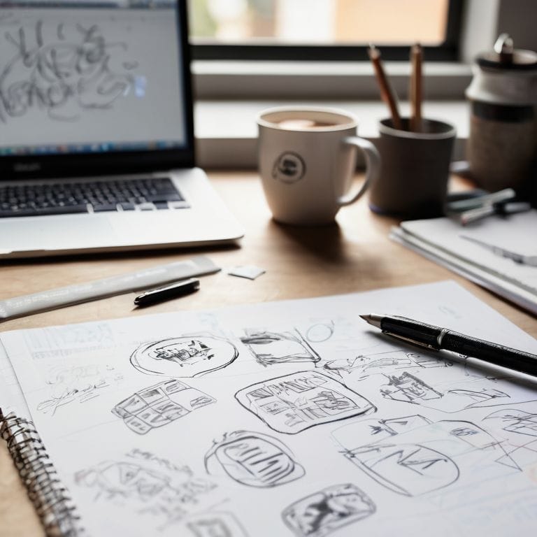
- 3. Now, it’s time to brainstorm and sketch out initial ideas. I’m a firm believer in the power of freehand drawing, as it allows us to tap into our creative subconscious and explore different concepts without the constraints of digital tools. This is also an opportunity to apply the principles of typographic hierarchy, thinking about how the logo will be used in various contexts and how it will be perceived by the audience.
- 4. With our initial ideas in hand, we can start to refine and iterate on our designs. This is where the grid system comes into play, helping us to create a balanced and harmonious composition. I often find myself quoting Josef Müller-Brockmann, who said, “The grid is a help, not a hindrance” – and I couldn’t agree more.
- 5. As we continue to refine our design, it’s essential to test and validate our concepts with the target audience. This can be done through surveys, focus groups, or even simple A/B testing. The goal is to gather feedback and make any necessary adjustments to ensure the logo resonates with the intended audience.
- 6. With our design nearing completion, we need to consider the logo’s versatility and how it will be used across different platforms and mediums. This includes thinking about scalability, color variations, and legibility – all critical factors in creating a timeless logo that will stand the test of time.
- 7. Finally, we finalize and implement our design, preparing it for use in various contexts, from business cards to billboards. This is where the typographic hierarchy comes into play once again, ensuring that the logo is used consistently and effectively across all touchpoints. As I always say, “A good design is not just about looking good, it’s about working well” – and that’s what we’re striving for with every logo design project.
Mastering Logo Design
As I delve into the nuances of logo design, I’m reminded of the wise words of Massimo Vignelli: “The life of a designer is a life of balance.” When it comes to custom logo creation tips, finding this balance is crucial. It’s about striking a chord between creativity and restraint, ensuring that your design is both unique and timeless.
To achieve this balance, I often recommend creating logo design inspiration boards. These visual tools help designers distill their ideas, explore different color theory in logo design concepts, and develop a cohesive visual language. By doing so, you’ll be able to refine your design and create a logo that truly reflects your brand’s identity.
In my experience, typography for logos is an often-overlooked yet vital aspect of logo design. Choosing the right font can make or break a design. I encourage designers to experiment with different typefaces, considering factors like legibility, scalability, and emotional resonance. By combining thoughtful typography with a deep understanding of color theory and composition, you’ll be well on your way to crafting a logo that is both beautiful and effective.
Custom Logo Tips
As I always say, quoting Massimo Vignelli, “The life of a designer is a life of fight: fight against the ugliness.” When it comes to custom logo design, this rings particularly true. To truly master the craft, one must consider the nuances of typography, color, and composition. A well-designed logo is not just a visual identity, but a reflection of the brand’s values and mission.
In my experience, a grid system and clear typographic hierarchy can make all the difference in creating a timeless logo. I recall a project where a simple, yet intentional, use of negative space elevated the design from ordinary to extraordinary. By applying these fundamental principles, designers can create custom logos that not only resonate with their audience but also stand the test of time.
Typography for Logos
When it comes to typography for logos, simplicity and clarity reign supreme. As Massimo Vignelli once said, “Typography is the core of graphic design.” I couldn’t agree more. A well-crafted typographic logo can be incredibly powerful, conveying the essence of a brand with precision and elegance. Consider the iconic logos of IBM or Coca-Cola – their typography is instantly recognizable and has become synonymous with their respective brands.
In crafting a typographic logo, it’s essential to balance legibility with distinctiveness. A clear typographic hierarchy and thoughtful font selection can make all the difference. I often turn to classic design principles, such as the use of a grid, to ensure harmony and cohesion in my designs. By doing so, you can create a logo that not only looks stunning but also communicates your brand’s message with intention and purpose.
Essential Considerations for a Timeless Logo
- Start with a clear understanding of your brand’s mission, values, and personality to ensure your logo design is authentic and meaningful
- Develop a robust design concept that incorporates a simple, yet distinctive typographic system and a well-crafted visual identity
- Experiment with various design elements, such as color, shape, and texture, to create a unique and recognizable logo that resonates with your target audience
- Apply the principles of grid systems and hierarchical typography to achieve balance, harmony, and visual flow in your logo design
- Test and refine your logo design by applying it to different contexts, such as business cards, billboards, and digital platforms, to ensure its versatility and effectiveness
Key Takeaways for Timeless Logo Design
Embracing a grid-based approach and clear typographic hierarchy is fundamental to creating a logo that is both aesthetically pleasing and effective in communication
Understanding the psychology of color and its impact on brand perception is crucial for selecting a palette that resonates with your target audience and reflects your brand’s values
By focusing on simplicity, scalability, and memorability, and iteratively refining your design through a process of critique and revision, you can craft a logo that stands the test of time and becomes an iconic symbol of your brand’s identity
The Design Philosophy
A well-crafted logo is not merely a decorative mark, but a thoughtful synthesis of form and function, born from a deliberate and iterative design process that harmoniously balances simplicity, clarity, and distinctiveness.
Alistair Finch
Bringing It All Together: The Power of Intentional Logo Design
As we’ve journeyed through the step-by-step logo design process, it’s clear that creating a timeless mark requires more than just technical skill – it demands a deep understanding of your brand’s essence and a commitment to clarity. From defining your brand’s mission and values to crafting a custom typography that speaks to your audience, each decision is an opportunity to refine your visual identity and distill your message. By embracing the principles of good design and avoiding the pitfalls of trends, you can create a logo that not only represents your brand but also elevates it.
As you embark on your own logo design journey, remember that the true power of design lies not in the tools or the trends, but in the intention behind each decision. Don’t just decorate – design with purpose. Let the grid be your guide, and let the timeless principles of typography, color, and composition be your north star. With patience, practice, and a willingness to learn, you can unlock the secrets of logo design and create a mark that truly resonates with your audience.
Frequently Asked Questions
What are the most common mistakes to avoid during the logo design process?
As I always say, quoting Massimo Vignelli, “the life of a designer is a life of fight: fight against the ugliness.” Common mistakes to avoid include inconsistent typography, poor color choices, and a lack of grid-based structure, all of which can lead to a disjointed and unprofessional visual identity.
How can I ensure my logo design is scalable and looks good in various formats and sizes?
To ensure scalability, I always design logos with a grid in mind, using simple, geometric shapes and clear typography. As Massimo Vignelli said, “The grid system is an aid, not a guarantee.” Test your logo in various sizes and formats, from business cards to billboards, to guarantee it remains legible and impactful.
What role does color theory play in the logo design process and how can I choose the most effective colors for my brand?
Color theory is a vital component of logo design, as it evokes emotions and conveys brand personality. I always say, “Color is a power which directly influences the soul,” as Wassily Kandinsky so aptly put it. When choosing colors, consider the 60-30-10 rule: 60% primary color, 30% secondary, and 10% accent, to create harmony and visual balance.


