An Introduction to What Is Color Theory for Creatives

As I sit amidst my collection of vintage design books, I often find myself pondering the question: what is color theory? It’s a topic that’s often shrouded in mystery, with many designers and non-designers alike believing it to be some sort of magic formula for creating visually stunning designs. But, in my experience, this couldn’t be further from the truth. The real power of color theory lies not in its ability to create flashy, attention-grabbing designs, but rather in its capacity to elevate a design from mere decoration to a thoughtful, intentional work of art.
In this article, I promise to cut through the hype and provide you with a no-nonsense understanding of color theory. I’ll share my own experiences, gained from years of working as a brand strategist and designer, to help you develop a deep appreciation for the role of color in design. We’ll explore the fundamental principles of color theory, and I’ll provide you with practical advice on how to apply these principles to your own design work. My goal is to empower you with the knowledge and confidence to make informed decisions about color, rather than simply following the latest trends or relying on intuition. By the end of this article, you’ll have a clear understanding of what is color theory and how to harness its power to create designs that are both beautiful and effective.
Table of Contents
What Is Color Theory

As I delve into the world of color, I’m reminded of the wise words of Massimo Vignelli, “Colors are a means of exerting a direct influence on the soul.” Color theory for designers is not just about selecting a palette that looks aesthetically pleasing, but about creating a visual language that communicates with the viewer on a deeper level. It’s about understanding the psychological effects of colors and how they can be used to evoke emotions, convey messages, and guide the user’s experience.
When it comes to creating a color scheme, many designers rely on intuition, but a well-designed color palette is rooted in color harmony principles. These principles provide a framework for selecting colors that work together in harmony, creating a visually appealing and balanced composition. By applying these principles, designers can create color palettes that are not only beautiful but also functional, taking into account factors such as color contrast and accessibility.
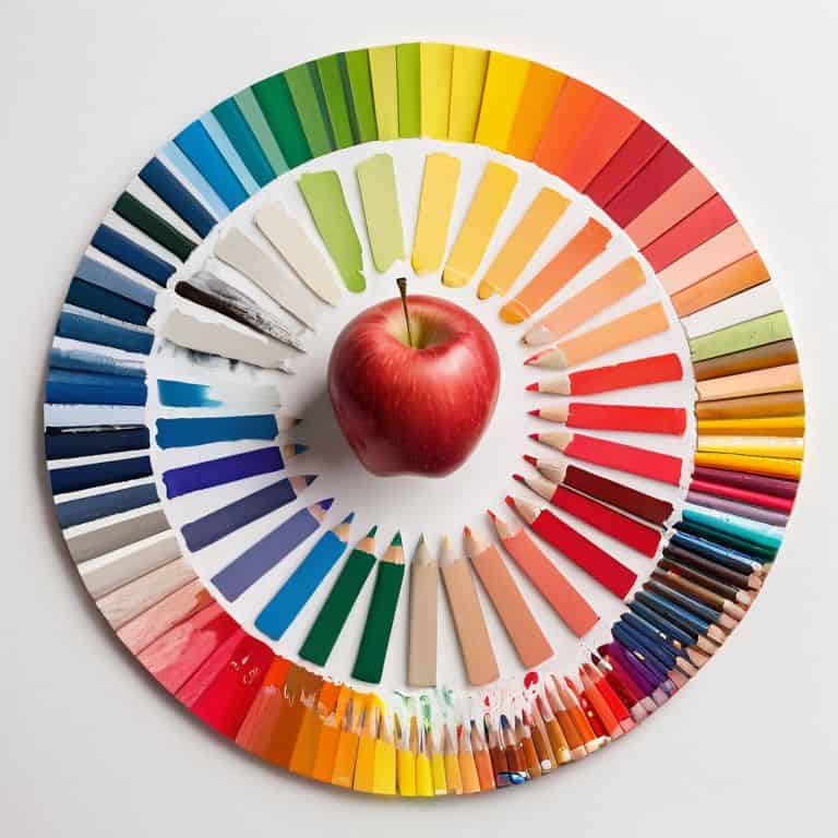
As a designer, I’ve found that a thorough color wheel analysis is essential for creating effective color palettes. By understanding how colors relate to each other on the color wheel, designers can create harmonious color schemes that enhance the user experience. Whether designing for print or digital media, such as creating color palettes for websites, a deep understanding of color theory is crucial for creating designs that resonate with the viewer and communicate the intended message.
Color Harmony Principles Revealed
As I delve into the world of color theory, I’m reminded of the wise words of Massimo Vignelli, who once said that a good design is one that is intentionally created. When it comes to color harmony, this intentionality is crucial. Color harmony principles are the foundation upon which a visually appealing design is built.
In my experience, creating harmony in design is not just about throwing a bunch of colors together, but rather about understanding how they interact with each other. Balance is key, and it’s achieved by considering factors such as contrast, proximity, and repetition. By applying these principles, designers can create compositions that are not only aesthetically pleasing but also effective in communicating their message.
Psychological Effects of Colors Unlocked
As we delve into the realm of color theory, it’s essential to consider the psychological effects of colors on our perception and emotions. Different hues can evoke distinct feelings, from the calming sensation of blue to the energetic vibe of orange. Understanding these effects is crucial in design, as it allows us to create intentional and impactful visual experiences.
The emotional resonance of colors plays a significant role in shaping our responses to a design. By carefully selecting a color palette, designers can influence the mood and atmosphere of a space or visual identity, guiding the viewer’s emotional journey and creating a lasting impression.
Mastering Color Theory Fundamentals
As I delve into the world of color theory, I’m reminded of the wise words of Massimo Vignelli, who once said, “Colors have a physical and emotional impact on people.” To truly master color theory fundamentals, one must understand the intricacies of color harmony principles, which serve as the foundation for creating visually appealing designs. By analyzing the color wheel, designers can unlock the secrets of color relationships and create harmonious palettes that evoke emotions and convey messages.
When it comes to creating color palettes for websites, designers must consider the psychological effects of colors on their audience. Different colors can elicit different emotions, from the calming effects of blue to the energetic vibes of orange. By selecting colors that align with their brand’s personality and message, designers can create an immersive experience that resonates with their target audience. Color contrast and accessibility are also crucial factors to consider, as they can make or break the user experience.
To take their design to the next level, artists and designers can benefit from color wheel analysis, which helps identify patterns and relationships between colors. By applying color harmony principles, designers can create a visual language that speaks to their audience and sets their brand apart. Whether designing for print or digital, a deep understanding of color theory fundamentals is essential for creating designs that captivate, inspire, and endure.
Balancing Contrast for Accessibility
To create visually appealing and accessible designs, it’s essential to consider the role of contrast in color theory. Balancing contrast is crucial, as it enables designers to guide the viewer’s attention and create a clear visual hierarchy. By adjusting the contrast between different elements, designers can ensure that their work is not only aesthetically pleasing but also easy to navigate.
Effective contrast balance is rooted in understanding the 60-30-10 rule, which suggests that a dominant color should occupy 60% of the design, a secondary color 30%, and an accent color 10%. This principle helps designers maintain a sense of harmony and balance, making their work more accessible to a wider audience.
Creating Palettes With Color Wheel Analysis
When analyzing the color wheel, I find that creating palettes is an art that relies heavily on understanding the nuances of color relationships. By studying the color wheel, designers can uncover hidden patterns and harmonies that elevate their designs. This thoughtful approach allows for the creation of unique and captivating color combinations.
To develop effective palettes, color contrast plays a crucial role. By balancing warm and cool colors, designers can craft visually appealing palettes that draw the viewer’s eye. This intentional use of contrast enables designers to guide the viewer’s attention and create a lasting impression.
5 Essential Color Theory Tips to Elevate Your Design
- Start with a limited color palette to ensure cohesion and visual flow, as Massimo Vignelli once said, ‘The easier it is to understand, the better it is’
- Consider the 60-30-10 rule: 60% of a dominant color, 30% of a secondary color, and 10% of an accent color to create balance and harmony
- Experiment with color wheel analysis to discover complementary, analogous, and triadic color schemes that add depth and interest to your designs
- Pay attention to the psychological effects of colors, such as the warmth of orange and red tones or the calmness of blue and green tones, to evoke the desired emotional response
- Remember that color theory is not just about aesthetics, but also about accessibility: ensure sufficient contrast between background and text colors to make your design readable for all audiences
Key Takeaways: Unlocking the Power of Color Theory
Color harmony principles, such as complementary, analogous, and triadic color schemes, can be used to create visually appealing designs that evoke emotions and convey messages
Understanding the psychological effects of colors, including their cultural and contextual implications, is crucial for designing effective brand identities and communication materials
Mastering color theory fundamentals, including color wheel analysis and contrast balancing, enables designers to create accessible and engaging designs that captivate audiences and leave lasting impressions
Unpacking the Essence of Color Theory
To me, color theory is not just a set of rules or a collection of trends, but a profound language that, when spoken with intention and clarity, can evoke emotions, convey meaning, and ultimately, transform the way we experience and interact with the world around us.
Alistair Finch
Beyond the Basics: Embracing the Power of Color Theory
As we’ve explored the fundamentals of color theory, from color harmony principles to the psychological effects of colors, it’s clear that mastering this discipline is key to creating visually stunning and effective designs. By understanding how to balance contrast and create palettes with color wheel analysis, designers can unlock the full potential of their work. Whether you’re a seasoned professional or just starting out, grasping the principles of color theory can elevate your designs and help you communicate your message with clarity and intention.
So, as you continue on your design journey, remember that color theory is not just a set of rules to be learned, but a timeless language that allows you to connect with your audience on a deeper level. By embracing the principles of color theory and making them your own, you’ll be able to create designs that inspire, educate, and elevate the human experience – and that’s a truly powerful thing.
Frequently Asked Questions
How do designers apply color theory principles in real-world projects to create effective visual communication?
In real-world projects, designers apply color theory principles by considering the 60-30-10 rule, where 60% of the palette is a dominant color, 30% a secondary color, and 10% an accent color. This balance creates visual harmony, as seen in the timeless designs of Massimo Vignelli, who once said, “Color is a power which directly influences the soul.
What role does cultural context play in the perception and interpretation of colors in design?
As Massimo Vignelli once said, “Design is one.” Yet, cultural context plays a significant role in shaping color perception. For instance, while white is often associated with purity in Western cultures, it symbolizes mourning in many Asian cultures. Understanding these nuances is crucial for effective design, as it can make or break the intended message.
Can color theory be used to evoke specific emotions or moods in a design, and if so, how do designers achieve this?
To evoke emotions, designers leverage color psychology, selecting hues that resonate with the desired mood. As Massimo Vignelli once said, “Color is a power which directly influences the soul.” By understanding how colors like red stimulate energy or blue convey calmness, designers intentionally craft palettes that elicit the intended emotional response, creating a profound connection with the viewer.


