An Explainer: What Is the Golden Ratio in Design?
I still remember the first time I encountered the golden ratio in design. It was in a dusty old bookstore, where I stumbled upon a vintage design book that explained how this mathematical concept could elevate a design from ordinary to extraordinary. As I delved deeper into the world of design, I realized that the golden ratio was not just a fancy term, but a timeless principle that could make or break a design. But what is the golden ratio in design, really? Is it just a myth, or is there substance to its supposed magical properties?
As someone who’s spent years studying and applying the principles of good design, I’m here to tell you that the golden ratio is not just a buzzword, but a foundational element that can make your designs more balanced, more harmonious, and more effective. In this article, I’ll cut through the hype and share my honest, experience-based advice on how to understand and apply the golden ratio in your design work. I’ll show you how to use it to create designs that are not just aesthetically pleasing, but also intentional and purposeful. So, if you’re ready to learn the why behind the golden ratio, and how to harness its power in your own design practice, then let’s dive in and explore the world of what is the golden ratio in design.
Table of Contents
- Unpacking the Golden Ratio
- What Is the Golden Ratio in Design
- Aesthetic Appeal of the Golden Ratio Design Principles
- Golden Rectangle Composition Symmetry Examples
- Harnessing the Power of the Golden Ratio: 5 Essential Tips for Designers
- Key Takeaways: Harnessing the Power of the Golden Ratio
- The Essence of Timeless Design
- Embracing the Timeless Beauty of the Golden Ratio
- Frequently Asked Questions
Unpacking the Golden Ratio

As I delve into the world of design, I find myself drawn to the golden ratio in typography, where this mathematical concept is used to create visually appealing layouts. The golden ratio, also known as the Fibonacci sequence, is a series of numbers in which each number is the sum of the two preceding numbers. This sequence has been observed in nature and has been used in art and design for centuries to create a sense of balance and harmony.
When applied to design, the golden ratio can be used to create a golden rectangle composition, where the ratio of the longer side to the shorter side is equal to the golden ratio. This creates a sense of symmetry and balance, which can be very pleasing to the eye. I’ve seen this principle used to great effect in the work of designers like Massimo Vignelli, who was known for his use of simple, elegant typography and composition.
The aesthetic appeal of the golden ratio lies in its ability to create a sense of visual harmony, which is essential for good design. By using the golden ratio in design, designers can create layouts that are not only visually appealing but also balanced and harmonious. Whether it’s used in typography, composition, or other design elements, the golden ratio is a powerful tool for creating designs that are both beautiful and effective.
Fibonacci Sequence in Art Timeless Principles
As I delve into the realm of art, I’m reminded of the intrinsic beauty that the Fibonacci sequence brings to design. This mathematical concept has been a cornerstone of creative expression, from the composition of Renaissance paintings to the layout of modern graphic design. By applying the principles of the Fibonacci sequence, artists can create a sense of visual balance that draws the viewer in and guides their eye through the piece.
The use of the Fibonacci sequence in art is a testament to the power of timeless principles in design. By understanding and applying these principles, artists and designers can create works that are not only aesthetically pleasing but also intentionally crafted to evoke a specific response from the viewer.
Golden Ratio in Typography Visual Harmony
When it comes to typography, the golden ratio plays a subtle yet significant role in creating visual harmony. It’s the secret to balancing font sizes, line heights, and margins to create a composition that’s both aesthetically pleasing and easy to read. By applying the golden ratio to typography, designers can craft a visual flow that guides the reader’s eye through the content with ease.
In practice, this means using the golden ratio to determine the optimal ratio of font sizes between headings and body text. For instance, a heading set in a font size that’s 1.618 times larger than the body text can create a sense of balance and proportion, drawing the reader’s attention to the most important elements on the page.
What Is the Golden Ratio in Design
As I delve into the world of design, I find myself fascinated by the golden ratio in typography, which has been a cornerstone of visual harmony for centuries. This mathematical concept, also known as the divine proportion, has been used to create balanced and aesthetically pleasing compositions. I recall a particular project where I applied the golden ratio to a typography system, and the result was nothing short of stunning – the text seemed to flow effortlessly, creating a sense of symmetry in design that drew the viewer in.
The fibonacci sequence in art is another aspect of the golden ratio that I find intriguing. This sequence, in which each number is the sum of the two preceding numbers, has been used to create compositions that are both balanced and dynamic. By applying the fibonacci sequence to a design, one can create a sense of visual harmony that is both pleasing to the eye and engaging to the mind. I’ve seen this principle used to great effect in golden rectangle composition, where the resulting design is both elegant and sophisticated.
In my experience, the key to unlocking the aesthetic appeal of the golden ratio lies in its ability to create a sense of balance and harmony. By applying this principle to design, one can create compositions that are not only visually stunning but also timeless. As Massimo Vignelli once said, “The life of a designer is a life of fight: fight against the ugliness.” By embracing the golden ratio, designers can create beauty that transcends trends and speaks to something deeper within us.
Aesthetic Appeal of the Golden Ratio Design Principles
As I delve into the aesthetic appeal of the golden ratio, I’m reminded of timeless design principles that transcend trends. The way a well-crafted layout can evoke a sense of balance and harmony is truly remarkable. It’s a testament to the power of intentional design, where every element works in concert to create a visually stunning whole.
The golden ratio’s influence can be seen in various aspects of design, from typography to composition. By incorporating this mathematical concept, designers can create a sense of Flow and cohesion, drawing the viewer’s eye through the design with ease. This, in turn, creates an immersive experience that engages and resonates with the audience.
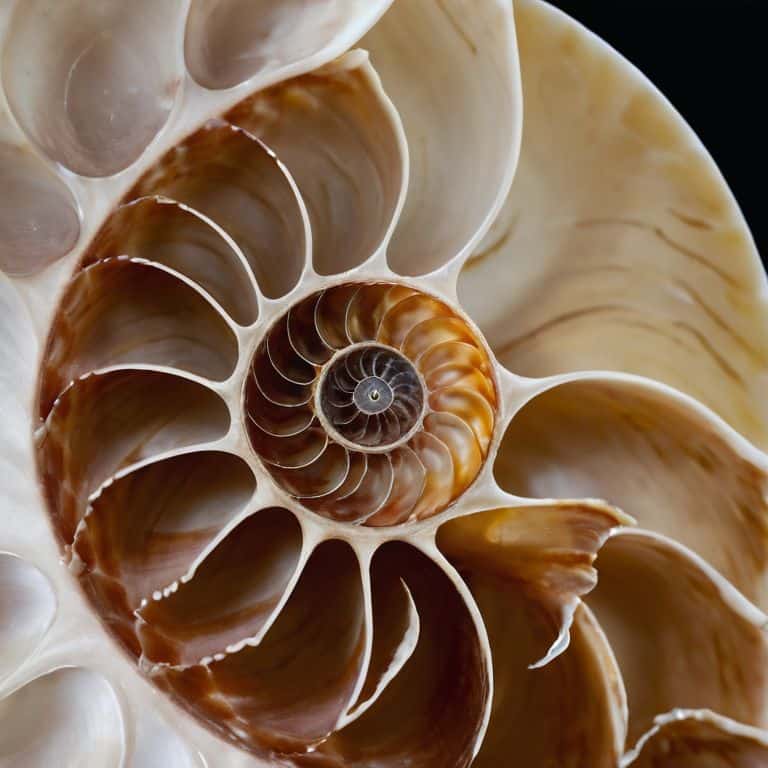
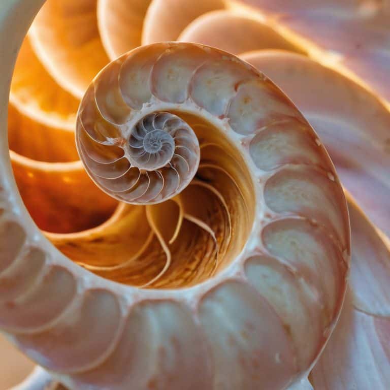
Golden Rectangle Composition Symmetry Examples
When composing with the golden ratio, I often think about the symmetry that arises from using a golden rectangle. This ancient principle, rooted in mathematics, brings a sense of balance and harmony to designs. By dividing a rectangle into two sections, where the ratio of the longer segment to the shorter is approximately 1.618, we create a framework for composition that is both aesthetically pleasing and grounded in reason.
In practice, grid-based systems allow designers to effortlessly incorporate the golden ratio into their work, creating compositions that feel intentionally designed, rather than merely decorative.
Harnessing the Power of the Golden Ratio: 5 Essential Tips for Designers
- Apply the Golden Ratio to typography by using it to determine the optimal line height, font size, and margin spacing to create visual harmony
- Use the Fibonacci sequence to create a balanced composition, where the ratio of the smaller segment to the larger segment is approximately 0.618
- Experiment with the Golden Rectangle in your design, dividing the rectangle into smaller sections to create a sense of symmetry and balance
- Consider the aesthetic appeal of the Golden Ratio in your design, using it to create a sense of tension and resolution by balancing elements in a composition
- Remember that the Golden Ratio is a tool, not a rule, and should be used to enhance the overall design, rather than constrain it, allowing for creative freedom and experimentation
Key Takeaways: Harnessing the Power of the Golden Ratio
Effective use of the golden ratio in design can create a sense of visual harmony and balance, drawing the viewer’s eye through a composition with intentional precision
Understanding the Fibonacci sequence and its application in typography and art can help designers tap into timeless principles that elevate their work beyond fleeting trends
By incorporating the golden ratio into design elements such as composition, typography, and visual hierarchy, designers can create works that are not only aesthetically pleasing but also grounded in a deep understanding of the foundational rules of design
The Essence of Timeless Design
To me, the golden ratio in design is not just a mathematical concept, but a poetic whisper that reminds us of the beauty in simplicity, proportion, and intention – a principle that, when applied with care, can elevate the mundane to the sublime.
Alistair Finch
Embracing the Timeless Beauty of the Golden Ratio
As we’ve explored the golden ratio and its applications in design, it’s clear that this timeless principle offers a profound impact on visual harmony and aesthetic appeal. From the fibonacci sequence in art to the use of golden rectangle composition in symmetry examples, the golden ratio has proven to be a versatile and powerful tool for designers. By understanding and applying the golden ratio, designers can create designs that are not only visually stunning but also deeply resonant with audiences.
As we move forward in our design journeys, let’s remember that the golden ratio is more than just a mathematical concept – it’s a design principle that can help us tap into the very essence of beauty and harmony. By embracing the golden ratio and other timeless design principles, we can create designs that transcend trends and speak to something deeper within us, inspiring a sense of timeless magic that never fades.
Frequently Asked Questions
How can I apply the golden ratio to create visually appealing compositions in my design work?
To create visually appealing compositions, I apply the golden ratio by dividing my canvas into sections using the 1:1.618 ratio. This helps me place elements in a harmonious and balanced way, guiding the viewer’s eye through my design. As Massimo Vignelli said, “The grid system is an aid, not a guarantee.
What role does the golden ratio play in typography and font selection?
In typography, the golden ratio ensures visual harmony by balancing font sizes, line heights, and margins. I apply this principle by using it to determine optimal font pairings and text block arrangements, creating a clear typographic hierarchy that guides the reader’s eye.
Can the golden ratio be used in digital design, such as website layouts and user interface elements?
Absolutely, the golden ratio can elevate digital design, from website layouts to UI elements, by creating a sense of balance and harmony. I’ve seen it used effectively in responsive design, where grids and typography come together to create a seamless user experience, much like the timeless designs of Massimo Vignelli.


