7 Common Logo Design Mistakes to Avoid
As I sit here, surrounded by my collection of vintage design books, I’m reminded of the wise words of Massimo Vignelli: “Design is one.” It’s a principle that has guided my work as a brand strategist and designer, and one that I believe is often overlooked when it comes to common logo design mistakes to avoid. The truth is, a great logo doesn’t happen by chance – it’s the result of clear intention, careful planning, and a deep understanding of the principles of good design. I’ve seen far too many logos that are more like decorations than thoughtful, well-crafted symbols of a brand’s identity.
In this article, I’ll share my expertise on how to avoid the most _common pitfalls_ in logo design, and provide you with practical advice on how to create a logo that truly represents your brand. You’ll learn how to think like a designer, and how to apply timeless principles to your design work. From the importance of _typographic hierarchy_ to the role of color in logo design, I’ll cut through the noise and provide you with honest, no-hype guidance on how to create a logo that will stand the test of time. By the end of this article, you’ll have a clear understanding of what it takes to create a great logo, and how to avoid the common mistakes that can derail even the best design intentions.
Table of Contents
- Guide Overview: What You'll Need
- Step-by-Step Instructions
- Common Logo Design Mistakes to Avoid
- Steering Clear of Common Pitfalls: 5 Key Tips for Effective Logo Design
- Key Takeaways for Effective Logo Design
- A Timeless Warning
- Designing with Intention: A Path to Timeless Logos
- Frequently Asked Questions
Guide Overview: What You'll Need
Total Time: 1 hour 30 minutes
Estimated Cost: $0 – $100
Difficulty Level: Intermediate
Tools Required
- Computer (with internet connection)
- Graphic Design Software (e.g., Adobe Illustrator, Canva)
- Color Picker Tool (optional)
Supplies & Materials
- Logo Design Templates (optional)
- Brand Style Guide (recommended)
- Paper and Pen (for brainstorming and sketching)
Step-by-Step Instructions
- 1. First, define your design principles by understanding the core values and mission of the brand you’re creating a logo for. This step is often overlooked, but it’s crucial in developing a logo that truly represents the brand’s identity. Take time to research and gather information about the brand’s history, target audience, and unique selling points. This will help you create a logo that is not only visually appealing but also meaningful and relevant.
- 2. Next, develop a clear design brief that outlines the specific requirements and goals of the logo design project. This should include information about the desired color palette, typography, and any specific design elements that need to be included. A well-crafted design brief will help guide your design decisions and ensure that you stay focused on creating a logo that meets the brand’s needs.
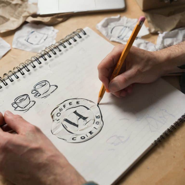
- 3. Now, sketch out initial ideas by hand, using a pencil and paper to brainstorm and explore different design concepts. This old-school approach may seem outdated in today’s digital age, but it’s an effective way to tap into your creative subconscious and generate a wide range of ideas. Don’t worry too much about refining your sketches at this stage – just focus on getting your ideas down on paper.
- 4. Then, refine your design concepts by selecting the most promising ideas from your sketching session and developing them further using digital design tools. Pay attention to typographic hierarchy and ensure that your design is balanced, legible, and scalable. This is also a good time to experiment with different color palettes and design elements to see what works best for your logo.
- 5. After that, test your design for versatility by applying it to different contexts, such as business cards, billboards, and social media profiles. A good logo should be able to adapt to various formats and still look great. This step is essential in ensuring that your design is practical and effective in real-world applications.
- 6. Next, seek feedback from others by sharing your design with colleagues, peers, or even potential customers. Fresh eyes can help you identify any weaknesses or areas for improvement that you may have missed. Be open to constructive criticism and use it as an opportunity to refine your design further.
- 7. Finally, iterate and refine your design based on the feedback you’ve received, making any necessary adjustments to color, typography, or composition. This is also a good time to check for design consistency, ensuring that your logo aligns with the brand’s overall visual identity and messaging. By taking the time to carefully refine your design, you’ll be able to create a logo that is both effective and enduring.
Common Logo Design Mistakes to Avoid
When designing a logo, it’s essential to consider the psychological impact of color on your brand’s identity. Color psychology in branding plays a significant role in evoking emotions and conveying messages. For instance, using bold and bright colors can create a lively atmosphere, while muted tones can convey a sense of sophistication. However, relying on overused logo design elements, such as clichéd symbols or generic color schemes, can lead to a lack of distinctiveness.
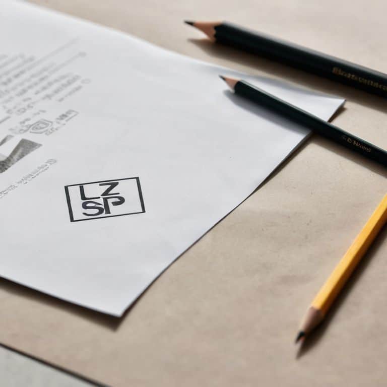
A well-crafted logo should strike a balance between simple vs complex logo designs. While simplicity can make a logo more recognizable and versatile, excessive complexity can render it illegible or confusing. Vector graphics for logos are an excellent choice, as they allow for scalability and flexibility across various platforms. By using vector graphics, designers can ensure their logos remain crisp and clear, regardless of the size or resolution.
Effective logo design also depends on typography best practices. The choice of font, spacing, and arrangement can significantly impact the overall aesthetic and message of the logo. Cultural sensitivity in logo design is another crucial aspect to consider, as logos can be perceived differently across various cultures and regions. By being mindful of these factors, designers can create logos that are not only visually appealing but also respectful and effective in communicating the brand’s values and mission.
Balancing Simple vs Complex Designs
As I often tell my students, the balance between simplicity and complexity is a delicate one. A design that is too simple can lack depth, while one that is too complex can be overwhelming. Massimo Vignelli once said, “The easier it is to understand, the better it is.” I believe this principle holds true in logo design. A well-crafted logo should strike a balance between these two extremes, conveying the essence of the brand in a clear and concise manner.
In my experience, a grid system can be a powerful tool in achieving this balance. By using a grid to organize and structure the design elements, you can create a sense of harmony and visual flow. This, in turn, allows the logo to be both simple and complex at the same time – simple in its overall form, yet complex in its nuances and details.
Beyond Overused Elements in Logos
When designing a logo, it’s easy to fall into the trap of relying on overused elements. We’ve all seen them – the ubiquitous globes, the stylized letters, the abstract shapes that are meant to represent “innovation” or “synergy.” But the truth is, these elements have been done to death. As Massimo Vignelli once said, “The life of a designer is a life of fight: fight against the ugliness.” To create a truly memorable logo, we must push past the clichés and strive for something more thoughtful, more intentional.
By doing so, we can create a visual identity that not only stands out from the crowd but also resonates with our audience on a deeper level.
Steering Clear of Common Pitfalls: 5 Key Tips for Effective Logo Design
- Rushing into design without a clear brand strategy, leading to a disjointed visual identity
- Overreliance on trends, rather than focusing on timeless principles of good design
- Insufficient consideration of scalability and versatility, resulting in a logo that doesn’t translate across platforms
- Neglecting the power of negative space and typography, leading to a cluttered and confusing visual message
- Failure to test and refine the design through iterative feedback and criticism, leading to a subpar final product
Key Takeaways for Effective Logo Design
Embracing simplicity and clarity in logo design is crucial, as it allows for versatility and recognition across various mediums and platforms, echoing the principles of design masters like Massimo Vignelli
Avoiding overused elements and trends is essential to create a unique and memorable brand identity, focusing instead on timeless principles of typography, color, and composition to guide the design process
Balancing simplicity with complexity, and understanding the importance of a well-structured typographic hierarchy and grid system, can elevate a logo from merely decorative to a powerful symbol of a brand’s values and mission
A Timeless Warning
A great logo is not a mere decoration, but a thoughtful distillation of a brand’s essence – and it’s the avoidable mistakes, not the design trends, that often stand between a mark that endures and one that fades into obscurity.
Alistair Finch
Designing with Intention: A Path to Timeless Logos
As we’ve explored the common logo design mistakes to avoid, it’s clear that good design is not just about aesthetics, but about creating a visual identity that resonates with your audience. By avoiding overused elements, striking a balance between simplicity and complexity, and embracing the power of typographic hierarchy, you can create a logo that truly represents your brand. Remember, a great logo is not a decoration, but a thoughtful representation of your brand’s values and mission.
So, as you embark on your own design journey, I encourage you to think like a designer, to consider the why behind every design decision. Don’t just follow trends or try to mimic others; instead, focus on crafting a visual identity that is authentic, intentional, and timeless. With patience, practice, and a deep understanding of the principles that govern good design, you can create a logo that will stand the test of time and become a lasting symbol of your brand’s values and mission.
Frequently Asked Questions
What are the most common mistakes designers make when trying to create a unique logo?
In my experience, one of the most common mistakes designers make is prioritizing novelty over clarity, often resulting in overly complex or convoluted logos that fail to resonate with their audience. As Massimo Vignelli once said, “The life of a designer is a life of fight: fight against the ugliness.
How can I ensure my logo design is scalable and effective across different platforms and mediums?
To ensure scalability, I always design logos with a clear typographic hierarchy and a simple, geometric core. This allows the mark to remain recognizable from business cards to billboards. As Massimo Vignelli once said, “The simpler, the better,” and I find this principle holds true for logos that need to shine across various platforms.
Are there any specific design elements or trends that are currently overused in logo design and should be avoided?
Indeed, some design elements have become clichés. I’d caution against overusing chevrons, anchors, and generic abstract shapes. These trends, much like Massimo Vignelli’s critique of excessive ornamentation, can dilute a brand’s unique identity. A well-crafted logo should be rooted in timeless principles, not fleeting fads.


