A Deep Dive Into the Psychology of Color in Design
As I sit here, surrounded by my vintage design books and the soft glow of my desk lamp, I’m reminded of the countless times I’ve seen the psychology of color in design being used as a buzzword to justify overly complicated and expensive design decisions. It’s a phenomenon that’s always left me scratching my head – do we really need to overthink the use of color to the point where it becomes a hindrance to good design? I recall a project I worked on where the client was adamant on using a specific shade of blue, citing its supposed “calming effects” on the user. But as I delved deeper into the design process, I realized that the true power of color lay not in its supposed psychological effects, but in its ability to create a sense of harmony and balance.
In this article, I promise to cut through the hype and provide you with practical advice on how to harness the power of color in your designs. I’ll share my own experiences, gleaned from years of working in the industry, to help you develop a deeper understanding of how color can be used to create emotional connections with your audience. We’ll explore the fundamentals of color theory, and I’ll provide you with actionable tips on how to create a cohesive visual identity that resonates with your users. My goal is to empower you with the knowledge and confidence to make informed design decisions, rather than relying on vague notions of “psychological effects.” So, let’s dive in and explore the world of color in design, shall we?
Table of Contents
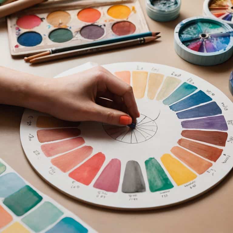
Decoding Color Psychology
As I delve into the world of color, I’m reminded of the wise words of Massimo Vignelli: “Color is a power which directly influences the soul.” Color theory in marketing is a complex beast, and one that requires a deep understanding of human emotions and cultural nuances. When it comes to designing a brand color palette strategy, it’s essential to consider the emotional impact of each hue on our audience.
The way we perceive color is deeply rooted in our cultural backgrounds, and cultural differences in color perception can make or break a design. For instance, while white is often associated with purity and innocence in Western cultures, it’s associated with mourning in many Asian cultures. This highlights the importance of considering emotional design principles when crafting a color palette for a global brand.
To create designs that truly resonate with people, we must also consider color contrast accessibility guidelines. By striking a balance between aesthetics and accessibility, we can ensure that our designs are not only visually stunning but also designing for emotional engagement. As a designer, it’s my goal to create a visual language that speaks to people on a deeper level, and I believe that color contrast is a crucial element in achieving this goal.
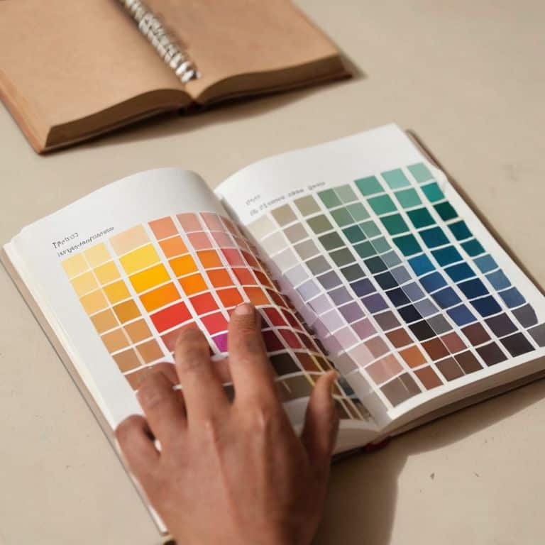
Beyond Trends Color Theory in Marketing
As I delve into the realm of color theory in marketing, I’m reminded of Massimo Vignelli’s wise words on the importance of clarity in design. A well-crafted color palette can make or break a brand’s identity, and it’s crucial to look beyond fleeting trends to create a lasting impression.
In my experience, a deep understanding of color harmony is essential for effective marketing. By applying timeless principles of color theory, designers can create visual identities that resonate with their target audience and leave a lasting impact, rather than simply following the latest fad.
Emotional Design Principles at Play
As we delve into the realm of color in design, it’s essential to consider the emotional resonance that different hues can evoke. A well-crafted color palette can create a lasting impression, influencing how users interact with a brand or product. By leveraging the psychological effects of color, designers can craft experiences that resonate with their audience on a deeper level.
Effective color schemes often rely on balance and harmony, striking a chord between contrasting elements to create visual interest. This delicate balance can make or break the emotional impact of a design, making it crucial for designers to approach color selection with intention and purpose.
The Psychology of Color in Design
As I delve into the world of color, I’m reminded of Massimo Vignelli’s wise words: “Colors are a means of exerting a direct influence on the soul.” Emotional design principles play a significant role in shaping our experiences, and color is a crucial element in this equation. A well-crafted brand color palette strategy can evoke emotions, convey values, and create a lasting impression.
When designing for emotional engagement, it’s essential to consider cultural differences in color perception. What may be perceived as a calming color in one culture may be seen as a symbol of mourning in another. This nuanced understanding of color theory is vital in creating a design that resonates with a diverse audience. By acknowledging these differences, designers can create a more inclusive and effective visual language.
In the context of marketing, color contrast accessibility guidelines are often overlooked, yet they are crucial in ensuring that designs are accessible to everyone. A thoughtful approach to color selection can make all the difference in creating a design that is both aesthetically pleasing and functional. By embracing the principles of color theory and emotional design, we can create experiences that not only captivate but also inspire and engage.
Accessible Contrast for Emotional Engagement
When designing for emotional engagement, accessible contrast is crucial. It’s not just about making elements visible, but also about creating a visual hierarchy that guides the viewer’s attention. I recall a project where we applied the 60-30-10 rule to balance contrast and create a clear focus.
To achieve this balance, I recommend using clear typographic hierarchies. By doing so, you can ensure that your design communicates effectively, even to those with visual impairments. This thoughtful approach will not only enhance the user experience but also elevate the emotional impact of your design.
Cultural Color Perception and Brand Strategy
As I delve into the realm of cultural color perception, I’m reminded of the wise words of Massimo Vignelli, who said that design is “one part idea, one part technique.” When considering brand strategy, it’s essential to understand how color associations vary across cultures. For instance, while white is often associated with purity and innocence in Western cultures, it’s associated with mourning in many Asian cultures.
In my experience working with Scandinavian design agencies, I’ve seen firsthand how cultural sensitivity can make or break a brand’s international success. By taking the time to research and understand the cultural nuances of color perception, designers can create more effective and respectful brand strategies that resonate with diverse audiences.
Harnessing the Power of Color: 5 Essential Tips

- Use a limited color palette to create a strong visual identity, as too many colors can be overwhelming and dilute your message
- Consider the 60-30-10 rule: 60% of your design should be a dominant color, 30% a secondary color, and 10% an accent color to create balance and harmony
- Understand the emotional connotations of different colors, such as red for energy and passion, blue for trust and stability, and green for growth and harmony
- Be mindful of cultural differences in color perception, as colors can have different meanings in different cultures and contexts, and ensure your design is sensitive to these differences
- Apply the principle of contrast to make your design more engaging, using color to create visual interest and draw attention to key elements, while also ensuring accessibility for all users
Key Takeaways: Harnessing the Power of Color in Design
Color is not just a visual element, but a strategic tool that can evoke emotions, convey messages, and influence user behavior, making it essential to approach color selection with intention and a deep understanding of its psychological impact
Effective use of color in design requires a balance between aesthetics and function, considering factors such as cultural perceptions, accessibility, and brand identity to create a harmonious and engaging visual experience
By applying principles of color theory and psychology, designers can create designs that resonate with their audience, foster emotional connections, and ultimately drive engagement, making the thoughtful use of color a critical component of successful design strategies
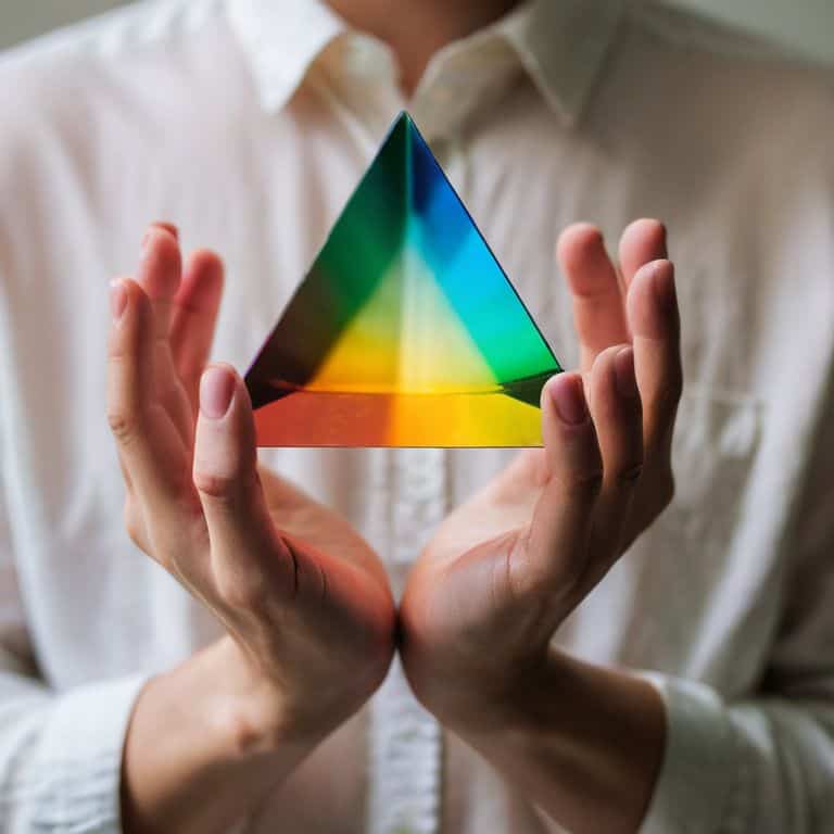
A Timeless Truth
Color is not just a matter of aesthetics; it’s a catalyst for emotion, a trigger for memory, and a cornerstone of connection – when used with intention, it can elevate design from mere decoration to profound communication.
Alistair Finch
Conclusion: Bringing Color to Life
As we’ve explored the psychology of color in design, it’s clear that color theory is not just about aesthetics, but about creating an emotional connection with our audience. We’ve delved into decoding color psychology, understanding how colors can evoke feelings and associations, and how cultural perceptions can impact our design choices. By considering emotional design principles and accessible contrast, we can craft designs that resonate with people on a deeper level. Whether it’s the boldness of red or the calmness of blue, colors have the power to manipulate our mood and influence our behavior.
As designers, it’s our responsibility to wield this power thoughtfully. So, let’s move beyond mere decoration and strive for intentional design. By doing so, we can create designs that not only look beautiful but also tell a story, evoke emotions, and leave a lasting impression. As Massimo Vignelli once said, ‘The life of a designer is a life of fight: fight against the ugliness.’ Let’s join this fight, armed with the knowledge of color psychology, and create designs that bring joy, clarity, and beauty to our world.
Frequently Asked Questions
How can I apply color psychology principles to create a consistent brand identity across different cultures?
To create a consistent brand identity across cultures, I recommend using a neutral color palette as a foundation, then adapting it with cultural nuances. As Massimo Vignelli said, “Design is one” – a unified vision can be achieved by understanding local preferences while maintaining your core visual identity.
What role does personal experience and memory play in shaping individual responses to certain colors in design?
For me, it’s about recognizing that personal experiences and memories can drastically influence how we respond to colors. As Massimo Vignelli said, “Design is one” – and that oneness includes our individual histories. A color that evokes warmth in one person might evoke sadness in another, due to unique associations.
Can the psychology of color in design be used to create a specific emotional response, and if so, what are the key considerations for achieving this?
To craft a specific emotional response, I consider the 60-30-10 rule: 60% of the palette is a dominant color, 30% a secondary, and 10% an accent. This balance, combined with intentional typography and composition, can evoke a desired feeling, as Massimo Vignelli once said, “Design is one.


