A Guide on How to Choose a Color Palette for Your Brand

As I sit amidst my collection of vintage design books, I’m reminded of the wise words of Massimo Vignelli: “Colors are a means of exerting a direct influence on the soul.” Yet, when it comes to how to choose a color palette for your brand, many of us get lost in a sea of trends and guesswork. We’re often told that selecting a color scheme is a matter of personal preference, but I believe this approach neglects the intentional design that truly effective branding demands.
In this article, I’ll share my practical, no-nonsense approach to how to choose a color palette for your brand. You’ll learn how to move beyond fleeting trends and instead, craft a timeless color palette that reveals your brand’s soul. I’ll guide you through the process of creating a color scheme that’s both visually stunning and strategically sound, using real-world examples and typographic principles to illustrate key concepts. By the end of this guide, you’ll be equipped with the knowledge and confidence to make intentional design decisions that elevate your brand and resonate with your audience.
Table of Contents
- Guide Overview: What You'll Need
- Step-by-Step Instructions
- Choosing Timeless Colors
- Beyond Trends Color Theory for Branding
- Designing Consistent Visual Identity With Brand Color Psychology
- 5 Essential Tips for Crafting a Memorable Brand Color Palette
- Key Takeaways for Crafting a Timeless Color Palette
- The Heart of Color Selection
- Conclusion: Crafting a Timeless Brand
- Frequently Asked Questions
Guide Overview: What You'll Need

Total Time: 1 hour 30 minutes
Estimated Cost: $0 – $100
Difficulty Level: Intermediate
Tools Required
- Color Wheel (optional, for visual reference)
- Computer or Mobile Device (with internet access)
- Notebook or Journal (for brainstorming and note-taking)
Supplies & Materials
- Brand Style Guide Template (optional, for organization)
- Color Palette Inspiration Boards (physical or digital, for reference)
- Pantone Color Guide (optional, for precise color matching)
Step-by-Step Instructions
- 1. First, let’s establish a clear design brief that outlines the core values, mission, and personality of your brand. This will serve as the foundation for our color palette selection process. Take some time to reflect on what makes your brand unique and what emotions you want to evoke in your audience. Consider factors such as your brand’s history, industry, and target audience to ensure that your color palette is both relevant and effective.
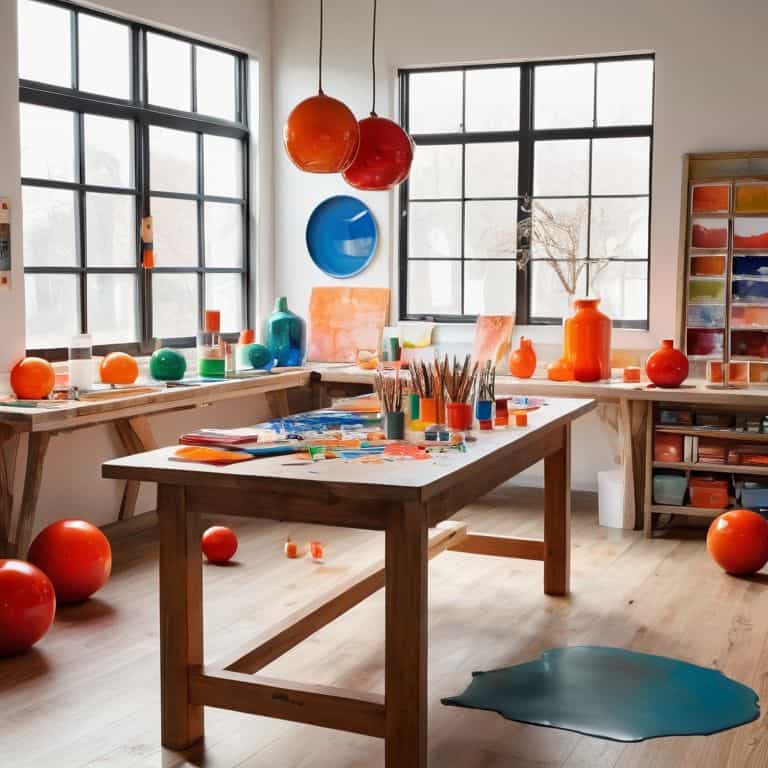
- 2. Next, I recommend _immersion in inspiration_ – gather a collection of images, textures, and colors that resonate with your brand’s personality and values. This can include nature, art, architecture, or even vintage design books like the ones I collect. Look for common themes, hues, or color combinations that emerge from your inspiration board, as these will help guide our color palette selection.
- 3. Now, let’s explore the 60-30-10 rule, a timeless principle in design that suggests dividing your color palette into dominant, secondary, and accent colors. Allocate 60% of your palette to a primary color, 30% to a secondary color, and 10% to an accent color. This balance will create visual harmony and ensure that your brand’s color palette is not too overwhelming or chaotic.
- 4. Consider the _emotional impact of color_ and how different hues can influence your audience’s perception of your brand. Warm colors like orange and red can evoke feelings of energy and excitement, while cool colors like blue and green can convey calmness and trust. Think about the emotional response you want to elicit from your audience and choose colors that align with your brand’s values and mission.
- 5. To add depth and nuance to your color palette, let’s introduce a neutral color that complements your primary and secondary colors. This can be a shade of gray, beige, or white that helps to balance out your palette and provides contrast. Remember, a good color palette is all about harmony and contrast, so don’t be afraid to experiment and find the perfect balance.
- 6. Now that we have a solid foundation for our color palette, it’s time to _refine and iterate_. Test your colors in different contexts, such as digital screens, print materials, and various lighting conditions. Make adjustments as needed to ensure that your colors remain consistent and effective across different platforms.
- 7. Finally, let’s put our color palette into action by applying it to real-world design scenarios. Create a style guide that outlines the usage of your colors, including typography, imagery, and composition. This will help ensure that your brand’s color palette is used consistently across all touchpoints, reinforcing your brand’s identity and building recognition with your audience.
Choosing Timeless Colors
When it comes to selecting colors that will stand the test of time, understanding color theory for branding is essential. This involves considering the emotional and psychological impact of different colors on your audience. For instance, warm colors like orange and red can evoke feelings of energy and excitement, while cool colors like blue and green can convey a sense of calmness and trustworthiness. By applying these principles, you can create a color palette that not only resonates with your target audience but also reflects your brand’s values and personality.
To ensure a consistent visual identity, it’s crucial to consider the brand color psychology behind your chosen colors. This involves thinking about how your colors will be perceived across different mediums and platforms, from digital screens to printed materials. Tools like pantone color matching for brands can help you achieve consistency and accuracy in your color reproduction. By taking a thoughtful and intentional approach to color selection, you can create a cohesive and recognizable brand image that sets you apart from the competition.
As you explore different color options, creating color palette inspiration boards can be a helpful way to visualize and refine your ideas. This involves gathering references and samples of colors that inspire you, and experimenting with different combinations to find the perfect fit for your brand. By taking the time to carefully consider your color choices and their potential impact on your brand’s visual identity, you can create a timeless and effective color palette that supports your brand’s mission and values.
Beyond Trends Color Theory for Branding
As I delve into the world of color theory, I’m reminded of Massimo Vignelli’s wise words: “The life of a designer is a life of fight: fight against the ugliness.” When it comes to branding, a well-grounded understanding of color theory is essential. It’s not just about selecting a palette that looks good, but about creating a visual language that resonates with your audience. By grasping the fundamental principles of color harmony, contrast, and context, you can craft a palette that not only stands the test of time but also elevates your brand’s message.
I often find myself referencing the works of Josef Müller-Brockmann, a Swiss design legend, who mastered the art of using color to convey meaning. His use of a limited color palette, combined with a thoughtful typographic hierarchy, resulted in designs that were both simple and powerful. By embracing a similar approach, you can create a color palette that is not only visually striking but also intentionally designed to communicate your brand’s values and personality.
Designing Consistent Visual Identity With Brand Color Psychology
To create a consistent visual identity, it’s essential to understand the psychology behind your brand colors. This is where the magic happens, and your brand starts to evoke emotions and connections with your audience. As Massimo Vignelli once said, “Colors have a physical and emotional impact on people.” By choosing colors that align with your brand’s values and personality, you can create a lasting impression. For instance, a brand that values simplicity and elegance might opt for a muted, monochromatic palette, while a brand that embodies playfulness and energy might choose a bold, bright color scheme.
By applying color psychology principles, you can ensure that your brand’s visual identity is not only consistent but also intentional and meaningful. This, in turn, will help you build a strong brand foundation that resonates with your target audience.
5 Essential Tips for Crafting a Memorable Brand Color Palette

- Start with a clear understanding of your brand’s personality and values, as this will help guide your color selection and ensure consistency across all touchpoints
- Consider the emotional impact of different colors on your target audience, and choose a palette that resonates with your brand’s message and tone
- Limit your palette to 2-3 core colors, and use variations of these colors to create a cohesive visual identity that can be applied across various mediums
- Experiment with different color combinations using the 60-30-10 rule, where 60% of the palette is a dominant color, 30% a secondary color, and 10% an accent color
- Test your color palette in different contexts, including digital and print applications, to ensure it remains legible and effective in various environments and lighting conditions
Key Takeaways for Crafting a Timeless Color Palette
Embrace the power of simplicity by limiting your color palette to a maximum of 3-5 core colors, ensuring consistency and recognition across all brand touchpoints
Apply the principles of color theory to create a harmonious palette that evokes the desired emotional response from your audience, rather than simply following the latest design trends
Consider the psychological impact of your brand colors and strive for a balance between contrast, legibility, and emotional resonance to create a visual identity that truly reflects your brand’s values and personality
The Heart of Color Selection
A color palette is not just a collection of hues, but a symphony of emotions, values, and intentions – choose yours with the conviction that it will be the visual voice of your brand, whispering its story to the world.
Alistair Finch
Conclusion: Crafting a Timeless Brand
In our journey to choose a color palette for our brand, we’ve explored the importance of understanding our brand’s soul and crafting a visual identity that resonates with our audience. We’ve delved into the world of color theory, learning how to apply its principles to create a timeless color palette that transcends fleeting trends. By considering the psychological impact of colors and designing a consistent visual identity, we can create a brand that truly connects with our customers. Whether you’re a seasoned designer or just starting out, remember that choosing a color palette is not just about aesthetics; it’s about intentional design that communicates your brand’s values and mission.
As you embark on your own design journey, I encourage you to think beyond the trends and focus on creating a authentic brand experience. Don’t be afraid to experiment, to take risks, and to push the boundaries of what’s possible. Remember, good design is not an accident; it’s the result of clear intention and a deep understanding of the principles that govern our craft. By embracing these principles and staying true to your brand’s essence, you’ll be well on your way to creating a visual identity that inspires, educates, and ultimately, leaves a lasting impression on your audience.
Frequently Asked Questions
How can I ensure my brand's color palette resonates with my target audience without being too trendy?
To resonate with your audience, consider the emotional connection they have with certain colors. As Massimo Vignelli said, “Colors have a physical and emotional impact.” Analyze your target audience’s preferences, values, and cultural background to choose a palette that harmonizes with their psyche, rather than blindly following trends.
What role does color contrast play in creating an effective brand color palette, and how can I apply it?
Color contrast is crucial for visual harmony. As Massimo Vignelli said, “Contrast is the way to make things clear.” I apply this principle by balancing warm and cool hues, light and dark values, to create a palette that’s both legible and engaging. A well-considered contrast strategy ensures your brand’s message shines through, even in the most complex compositions.
Can a brand successfully use a single color in its palette, or is it always necessary to have a combination of colors?
While many brands opt for multi-color palettes, a single color can be incredibly effective, as seen in Nike’s iconic orange or Coca-Cola’s distinctive red. A well-chosen solo color can create instant recognition and visual cohesion, simplifying your brand’s visual identity and making it more memorable.


