A Guide to Choosing Ink for Block Printing
As I sit in my workshop, surrounded by half-finished projects and the scent of freshly cut wood, I’m reminded of the countless times I’ve been asked about a guide to choosing ink for block printing. It’s a question that seems simple enough, but one that can make all the difference in the world when it comes to bringing your handmade creations to life. I’ve lost count of how many times I’ve seen beautiful designs fall flat due to the wrong ink choice, and it’s a mistake that can be avoided with a little patience and practice.
In this article, I’ll share my personal approach to selecting the perfect ink for your block printing projects, and provide you with honest, no-hype advice on how to make the right choice every time. We’ll dive into the world of ink possibilities, exploring the different types, colors, and textures available, and I’ll show you how to match your ink to your unique design style. Whether you’re a seasoned maker or just starting out, my goal is to empower you with the knowledge and confidence to create stunning, one-of-a-kind pieces that reflect your personality and style.
Table of Contents
Guide Overview: What You'll Need
Total Time: 1 hour 30 minutes
Estimated Cost: $20 – $50
Difficulty Level: Easy
Tools Required
- Ink Brayer (for applying ink to block)
- Roller (for mixing ink)
- Gloves (for protecting hands from stains)
Supplies & Materials
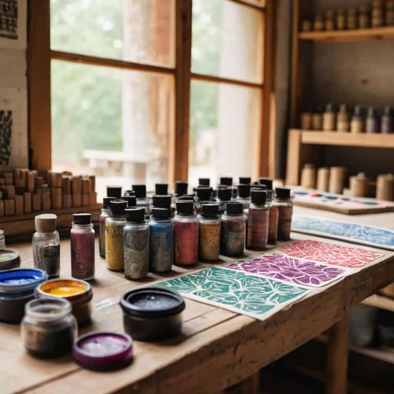
- Block Printing Ink (various colors)
- Linoleum Blocks (or other block printing materials)
- Paper (for printing, preferably 80 gsm or higher)
- Ink Tray (for holding ink, approximately 6 inches by 4 inches)
Step-by-Step Instructions
- 1. First, let’s start by exploring the world of ink and understanding the different types available for block printing. We have oil-based inks, water-based inks, and even natural inks made from plants and minerals. Each type has its own unique characteristics, and choosing the right one will depend on the effect you want to achieve in your design.
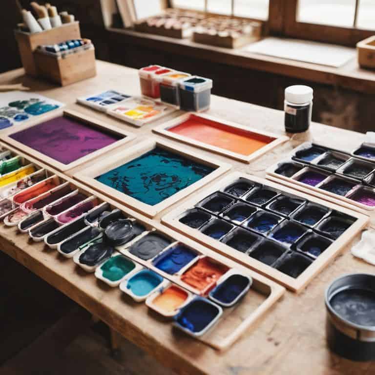
- 2. Next, consider the color palette you want to work with. Think about the mood and atmosphere you want to create with your block print. Do you want bold and vibrant colors, or more muted and subtle tones? Look for ink swatches or samples online to get an idea of how different colors will look on paper.
- 3. Now, let’s talk about ink viscosity. The consistency of the ink will affect how it flows off the block and onto the paper. Thicker inks are great for creating bold lines and textures, while thinner inks are better suited for delicate designs and details. You can always adjust the viscosity by mixing the ink with a medium or solvent.
- 4. To test the ink, create a simple test print by applying a small amount of ink to your block and printing it onto a scrap piece of paper. This will give you an idea of how the ink will look and feel on the paper. Pay attention to how the ink spreads, and whether it’s too light or too dark.
- 5. Once you’ve narrowed down your ink options, it’s time to think about the paper you’ll be printing on. Different papers will absorb the ink in different ways, so it’s essential to choose a paper that will work well with your chosen ink. Look for papers with a smooth texture and a high cotton content for the best results.
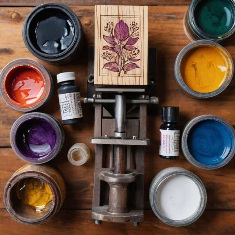
- 6. Now, let’s get hands-on and mix our own custom ink colors. This is where the magic happens, and you can create unique, one-of-a-kind hues that reflect your personal style. Start by mixing small amounts of ink on a palette or plate, and test the colors on a scrap piece of paper until you find the perfect shade.
- 7. Finally, record your findings in a notebook or journal, including notes on the ink types, colors, and viscosities you’ve tested. This will help you keep track of your progress and make it easier to replicate your favorite colors and techniques in the future. Take photos of your test prints and include them in your notebook for reference.
A Guide to Choosing Ink
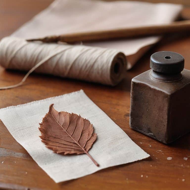
As I delve into the world of block printing, I’m reminded that the right ink can make all the difference. Viscosity is a crucial factor to consider, as it affects the ink’s flow and overall performance on different materials. When experimenting with natural dyes, I’ve found that they can add a unique, earthy tone to my prints. However, it’s essential to ensure that the ink adheres well to the chosen fabric, whether it’s cotton, linen, or silk.
To achieve the perfect print, I always consider the ink adhesion on various fabrics. This involves testing the ink on small, inconspicuous areas to guarantee the desired results. Safety precautions are also vital when working with block printing ink, as some chemicals can be hazardous if not handled properly. By taking the necessary precautions and using high-quality materials, I can focus on the creative process and enjoy the journey of bringing my designs to life.
When it comes to custom color mixing, the possibilities are endless. I love experimenting with different ratios of ink to create unique, custom hues that reflect my personal style. To ensure the durability of my prints, I conduct a block printing ink durability test, which involves washing and wearing the printed fabrics to assess their resistance to fading and wear. This step may seem tedious, but it’s essential for creating long-lasting, beautiful pieces that tell a story.
Ink Viscosity for Block Printing
When it comes to block printing, the viscosity of the ink is just as important as its color. I like to think of it as the ink’s personality – some are thick and stubborn, while others are smooth and free-flowing. For block printing, you’ll want an ink that’s just right, not too thick that it clogs the design, but not too thin that it loses its vibrancy.
I’ve found that a medium to high viscosity ink works best for most block printing projects. This allows for crisp, detailed lines and a beautiful texture that showcases the natural grain of the material. Of course, the perfect viscosity will depend on your specific project and the type of block you’re using, but as a general rule, a medium viscosity ink is a great place to start.
Natural Dyes for Custom Hue
As I experiment with natural dyes, I’m constantly amazed by the unique hues they bring to my block printing projects. From the earthy tones of indigo and turmeric to the soft pastels of beetroot and pomegranate, these dyes add a depth and character that’s hard to replicate with synthetic inks. I love how the imperfections in the dyeing process – the subtle variations in color and texture – give my prints a sense of organic, handmade beauty.
To create custom hues, I often blend different natural dyes to achieve the perfect shade. It’s a trial-and-error process, but one that allows me to tap into my creative intuition and connect with the materials on a deeper level. Whether I’m mixing a rich, dark brown from walnut and coffee, or a vibrant orange from marigold and annatto, the possibilities are endless – and the journey of discovery is just as rewarding as the final result.
Ink Scriptions: 5 Hands-On Tips for Choosing the Perfect Hue
- Experiment with Small Batches: Before committing to a large quantity of ink, test your design with small batches to ensure the color translates as expected
- Consider the Paper Type: Different papers absorb ink uniquely, so it’s crucial to test your ink on the specific paper you plan to use for your block printing project
- Think Beyond Color: The viscosity and texture of the ink can greatly impact the final result, so don’t be afraid to mix and match until you find the perfect consistency
- Play with Natural Dyes: Custom hues can add an extra layer of personality to your designs, and using natural dyes like plant extracts or spices can create one-of-a-kind colors
- Let Imperfections Shine: Remember, the unique characteristics of handmade ink can become a beautiful part of your design’s story, so don’t be too hard on yourself if things don’t turn out exactly as planned
Ink Scriptions: 3 Key Takeaways for Block Printing
As you experiment with different inks, remember that the viscosity of your ink can make or break the crispness of your block print design – thicker inks are perfect for bold lines, while thinner inks allow for more delicate details
Natural dyes can add an extra layer of uniqueness to your handmade prints, and with a little patience and experimentation, you can create custom hues that reflect your personal style and story
Whether you’re a seasoned maker or just starting out, the right ink can elevate your block printing from a simple craft to a meaningful form of self-expression – don’t be afraid to try new things and see where the process takes you
The Art of Ink Selection
As I always say, the ink is not just a medium, it’s the messenger of your creativity – it’s what brings your block printing designs to life, and gives them a voice that whispers stories to those who touch them.
Finn Rivera
Embracing the Art of Block Printing
As we’ve explored the world of block printing, it’s clear that choosing the right ink is a crucial step in bringing your designs to life. From understanding ink viscosity to experimenting with natural dyes, each decision contributes to the unique character of your handmade piece. By considering these factors and embracing the process, you’ll not only create something beautiful but also infuse it with your personal story. Remember, the imperfections and nuances that come with handmade objects are what make them truly special.
So, as you embark on your block printing journey, I encourage you to view it as a form of personal storytelling. Don’t be afraid to experiment and try new things, for it’s in these moments of creative freedom that we often discover our most remarkable work. With every cut, every stamp, and every brushstroke, you’re not just creating art – you’re crafting a piece of yourself, and that’s what makes it truly unforgettable.
Frequently Asked Questions
What are the most common mistakes to avoid when mixing natural dyes to achieve a custom hue for block printing?
When mixing natural dyes, I’ve found that common mistakes include not accounting for mordant ratios, over-saturating the mixture, and failing to test the color on a small scale first. These oversights can lead to inconsistent hues and wasted materials. To avoid this, I always start with a small test batch and tweak from there.
How does the viscosity of the ink affect the overall texture and appearance of the printed design?
The viscosity of the ink plays a huge role in the texture and appearance of the printed design. Thicker inks tend to hold more texture and detail, while thinner inks produce smoother, more even prints. I love experimenting with different viscosities to achieve unique effects – it’s all about finding the right balance for your design.
Can I use food-based dyes, like turmeric or beet juice, to create unique and sustainable ink colors for my block printing projects?
I love experimenting with unconventional dyes. Turmeric and beet juice can create stunning, earthy hues. Just be aware that food-based dyes might not be as lightfast as commercial inks, so your prints may fade over time. Still, the unique tones and sustainable aspect make them well worth exploring in your block printing journey.