The Difference Between Color Correction and Color Grading
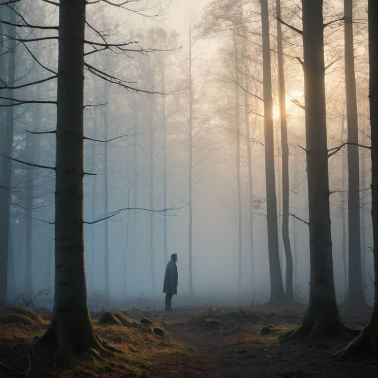
I still remember the first time I realized that the difference between color correction and color grading wasn’t just about tweaking colors, but about crafting the emotional core of a film. I was working on a documentary project, and my editor kept telling me that we needed to “fix” the colors to make the footage look more polished. But I knew that there was more to it than just making everything look pretty. I wanted to create a mood, a feeling that would draw the audience in and refuse to let go. That’s when I discovered the power of color correction and color grading, and how these two techniques could make or break the entire narrative of my film.
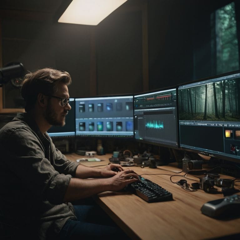
As a documentary filmmaker, I’ve learned that the art of storytelling is just as much about the edit as it is about the footage itself. In this article, I’ll share my personal experience and no-nonsense advice on how to navigate the difference between color correction and color grading, and use these techniques to elevate your own films. I’ll cut through the hype and give you a clear understanding of how to use color correction and grading to create a timeless story that resonates with your audience. Whether you’re a seasoned filmmaker or just starting out, my goal is to provide you with the practical knowledge and inspiration you need to take your filmmaking to the next level.
Table of Contents
Unveiling Color Secrets
As I delve into the world of color, I’m reminded of the countless hours I’ve spent perfecting the color temperature adjustment in my own films. It’s astonishing how a simple tweak can transport your audience to a different time and place. I recall working on a documentary where we used _luma vs chroma correction_ to enhance the mood of a particular scene, and it completely transformed the narrative.
When it comes to color grading, I’m often asked about the benefits of using _Basilite vs DaVinci Resolve_. While both are incredible tools, I find that DaVinci Resolve offers more flexibility when it comes to primary vs secondary color grading. This allows me to make precise adjustments to specific elements within a scene, creating a more immersive experience for the viewer.
In my quest for cinematic perfection, I’ve also experimented with _film stock emulation_ to give my footage a unique, nostalgic feel. By applying these techniques, I’ve discovered that color correction and grading are not just about fixing errors, but about weaving a visual tapestry that draws the audience in and refuses to let go. Whether I’m working on a documentary or a short film, my goal is always to create a world that feels authentic and captivating.
Baselight vs Davinci Choosing Your Ally
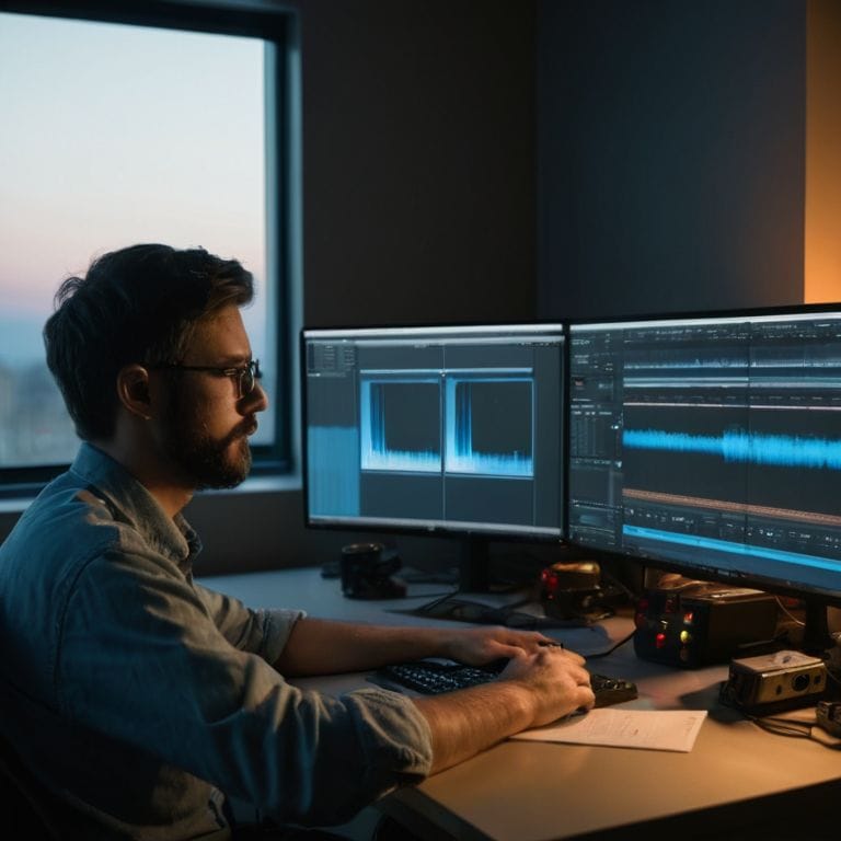
When it comes to color grading, the tools you use can make all the difference. I’ve had the chance to work with both Baselight and DaVinci, and I can tell you that each has its own unique strengths. Precision is key when choosing between these two, as it can greatly impact the final look of your film.
In my experience, intuitive interface is crucial for a smooth color grading process. Baselight and DaVinci both offer unique features, but it’s essential to consider which one aligns better with your workflow and creative vision.
Luma vs Chroma the Nuanced Dance
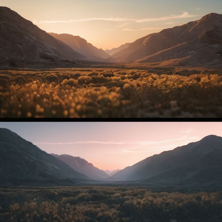
As I delve into the world of color correction and grading, I’m reminded of the delicate balance between luma and chroma. It’s a nuanced dance, where the brightness and darkness of an image (luma) must be carefully calibrated with its color properties (chroma). This harmony is crucial in setting the tone and mood of a scene.
In my experience, precise control over luma and chroma is essential in creating a visually stunning narrative. By adjusting these elements, I can draw the viewer’s attention to specific details, evoke emotions, and even influence the pacing of a scene.
Color Correction Meets Grading
As I dive into the world of color correction and grading, I’m reminded of the power of subtlety. A slight _color temperature adjustment_ can completely shift the mood of a scene, transporting the viewer to a different time and place. I’ve seen it time and time again in my own films, where a simple tweak can elevate the entire narrative.
When it comes to _luma vs chroma correction_, the nuances are astounding. By carefully balancing these two elements, you can create a visual language that speaks directly to the heart of your story. I’ve worked with both Baselight and DaVinci Resolve, and each has its own unique strengths. Baselight’s _color space conversion techniques_ are unparalleled, while DaVinci’s _primary vs secondary color grading_ capabilities offer incredible flexibility.
In my experience, the key to mastering color correction and grading lies in film stock emulation. By understanding the aesthetic of different film stocks, you can infuse your digital footage with a timeless quality that’s nothing short of magical. Whether I’m working on a documentary or a branded content piece, I always strive to create a _visual narrative_ that’s both captivating and authentic.
Cracking the Code Primary vs Secondary
When diving into the world of color correction and grading, it’s essential to understand the distinction between primary and secondary color correction. Primary color correction refers to the initial adjustments made to the overall look and feel of the footage, setting the tone for the entire film. This stage is crucial in establishing the mood and atmosphere, and it’s where I spend most of my time experimenting with different color palettes to find the perfect fit.
As I move on to secondary color correction, I focus on making targeted adjustments to specific elements within the scene. This is where I fine-tune the colors, making sure that every detail, from skin tones to textures, contributes to the overall narrative. By carefully balancing these elements, I can create a visually stunning and cohesive film that draws the viewer in and refuses to let go, all thanks to the power of nuanced color grading.
Film Stock Emulation Timeless Storytelling
As I delve into the world of film stock emulation, I’m reminded of the power of nostalgic textures in evoking emotions. By mimicking the grain and color palettes of classic film stocks, we can transport our audience to a bygone era, adding a layer of depth to our narrative.
The art of film stock emulation lies in its ability to elevate the mood of a scene, making it feel more authentic and immersive. Whether it’s the warm, sun-kissed tones of Kodachrome or the moody, high-contrast look of Tri-X, each film stock has its own unique character that can be used to enhance the story.
Bringing Your Story to Life: 5 Essential Tips on Color Correction and Grading
- Start with color correction to establish a neutral baseline, ensuring consistency across all your clips before diving into the creative realm of color grading
- Understand the emotional impact of different color palettes on your narrative, using tools like color wheels and mood boards to guide your grading decisions
- Experiment with film stock emulations to add a unique, timeless quality to your footage, but do so judiciously to avoid overwhelming the story
- Pay attention to the interplay between luma and chroma, recognizing how subtle adjustments can dramatically alter the mood and focus of a scene
- Remember, color grading is 50% of your film’s visual identity – invest time in finding the right balance and tone to elevate your story and resonate with your audience
Key Takeaways for Timeless Storytelling
Color correction and grading are not just technical processes, but storytelling tools that can elevate your film’s emotional impact by creating a specific mood and atmosphere
Understanding the nuances of luma and chroma, as well as the strengths of different color grading software like Baselight and DaVinci, can help you make informed decisions in the editing room and bring your vision to life
By mastering the art of color correction and grading, and experimenting with techniques like film stock emulation, you can transform your footage into a compelling narrative that resonates with your audience and leaves a lasting impression
The Colorful Truth
Color correction is the foundation, the invisible scaffolding that holds your story together, while color grading is the brush that paints the emotional landscape of your film, transforming the ordinary into the extraordinary.
Maya Jenson
Conclusion: Weaving a Visual Tapestry
As we’ve explored the realms of color correction and grading, it’s clear that these two processes are intertwined yet distinct. We’ve delved into the nuances of luma and chroma, and examined the strengths of different software like Baselight and DaVinci. By understanding the differences between primary and secondary color correction, and how to effectively use film stock emulation, you’re now equipped to make informed decisions that will elevate your storytelling. Whether you’re working on a documentary, short film, or branded content, the art of color correction and grading can make all the difference in conveying your message and evoking emotions.
As you embark on your next project, remember that the true magic happens in the edit. It’s where the puzzle pieces of your footage come together, and the emotional resonance of your story is revealed. Don’t be afraid to experiment, to push the boundaries of what’s possible with color correction and grading. With practice and patience, you’ll develop your unique visual voice, and your films will become a testament to the power of cinematic storytelling. So, go ahead, take the leap, and watch your stories come alive in a way that will leave your audience spellbound and inspired.
Frequently Asked Questions
How do I know when to use color correction versus color grading in a particular scene?
For me, it’s all about the story I want to tell. Color correction is about accuracy, fixing inconsistencies, whereas color grading is about creating a mood, an atmosphere. Ask yourself, are you trying to fix a problem or evoke an emotion? That’s how I decide between correction and grading in a scene.
Can color grading completely override the need for color correction, or are they always used in tandem?
While color grading can enhance the mood and aesthetic, it can’t entirely replace color correction. Think of correction as setting the foundation, ensuring consistency, and grading as adding the emotional layer. They work hand-in-hand to create a cohesive visual narrative, with correction laying the groundwork for grading to shine.
What are some common mistakes to avoid when using color correction and grading tools, and how can I ensure a cohesive look throughout my film?
When wielding color correction and grading tools, I see many filmmakers fall into the trap of over-processing, losing the natural essence of their footage. To avoid this, I always advise to work in subtle increments, referencing your color script and maintaining consistency across scenes to craft a cohesive visual narrative.